When shoppers land on your eCommerce homepage, you have only a few seconds to capture their attention and guide them toward purchase. A well-crafted ecommerce homepage design doesn’t just look attractive—it works strategically to convert casual visitors into loyal customers.
In this comprehensive guide, we’ll break down the 10 essential elements that make a homepage high-converting, with examples, design principles, and practical tips you can apply immediately.
The 10 Crucial Elements of a High-Converting eCommerce Homepage Design
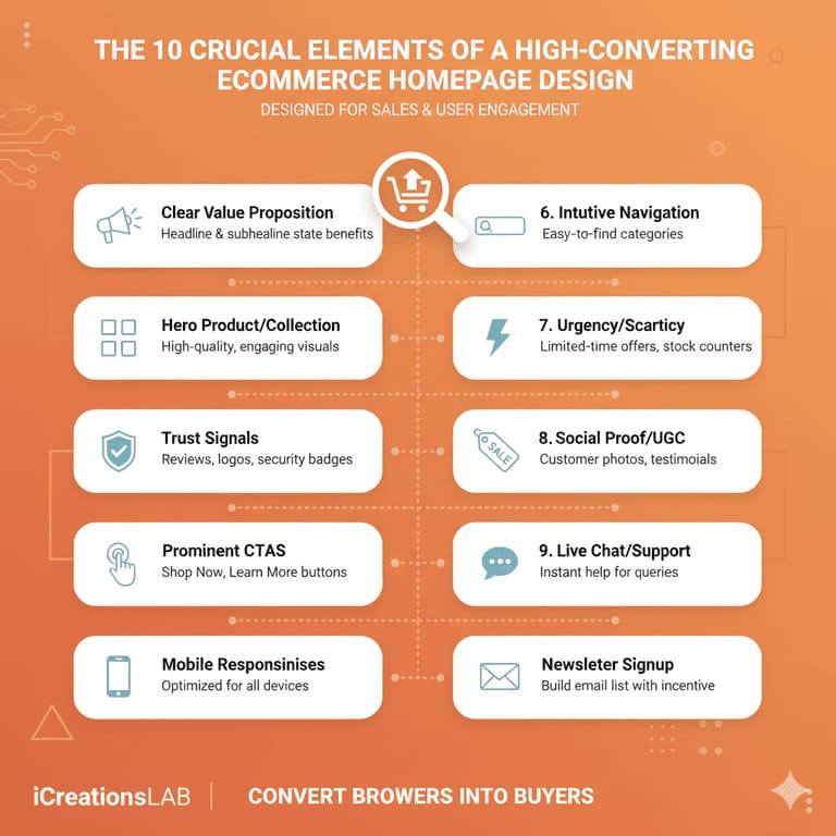
Every successful eCommerce homepage incorporates these ten fundamental elements, strategically placed and meticulously executed to maximize conversion potential.
1. Clear and Compelling Value Proposition
When visitors land on your ecommerce homepage, they must instantly understand who you are, what you sell, and why they should care. This simple clarity forms the foundation of an effective ecommerce homepage design. A strong value proposition is not just a catchy phrase—it’s your brand’s promise, clearly stated in words that resonate emotionally with your target audience.
Why It Matters
Your value proposition is the first impression of your business. In the crowded world of online shopping, where attention spans are short, a powerful and direct message can make the difference between a bounce and a sale. It answers three crucial questions:
- What problem do you solve?
Every product should fulfill a need—whether it’s convenience, quality, affordability, or self-expression. - What makes you different?
Highlight your unique selling point (USP): Is it sustainable materials, handmade craftsmanship, or local delivery speed? - Why should visitors trust you?
Trust comes from authenticity, reputation, and transparency. Displaying real guarantees, customer testimonials, or brand history can enhance this trust.
How to Apply
- Use a headline that clearly states your core benefit: e.g., “Modern Furniture That Fits Your Space and Lifestyle.”
- Add a subheadline that explains what you offer: “Stylish, affordable furniture crafted from sustainable materials.”
- Include a strong CTA (Call-to-Action) like “Shop Now,” “Discover More,” or “Start Exploring.”
- Avoid generic greetings like “Welcome to our store.” Instead, focus on clarity and benefit.
Example
“Sustainable Fashion, Designed to Last. Shop ethically made clothing you’ll love for years.”
This message conveys brand values, differentiators, and a promise—all within one concise line. When your ecommerce homepage design reflects this level of focus and authenticity, you give visitors a reason to explore further.
See More: 7 Critical Website Development Factors for Conversions
2. Eye-Catching Hero Banner
The hero banner is the visual centerpiece of your homepage and often the very first thing users see. It serves as the emotional entry point to your brand story—blending imagery, message, and design to make a powerful impact.
An effective hero banner captures both attention and intention. It introduces your product or promotion while encouraging visitors to take immediate action.
Key Design Principles
- Use high-quality product photography or lifestyle images that reflect your brand’s tone—clean, aspirational, or bold.
- Keep text minimal but meaningful. The headline should be easy to read within seconds.
- Ensure strong contrast between background and text to enhance readability.
- Incorporate a clear CTA button, such as “Shop Collection,” “View New Arrivals,” or “Get Yours Now.”
- Avoid clutter: one visual message per banner is enough. Too many competing visuals dilute focus.
Conversion Insight
Research shows users decide whether to stay or leave a site within 5–7 seconds. A striking, emotionally resonant hero section can reduce bounce rates dramatically.
For example, Nike’s homepage often features an athlete in motion paired with motivational text—this not only promotes a product but also reinforces brand emotion and identity.
Optimization Tips
- Update banners seasonally or during special sales to maintain freshness.
- Test different visuals and headlines (A/B testing) to find what drives engagement.
- On mobile, optimize image size and ensure that the CTA is visible without scrolling.
The best ecommerce homepage design treats the hero banner as both an art and a strategy—balancing creativity with conversion science.
3. Intuitive Navigation Menu
A beautiful homepage means little if users can’t find what they’re looking for. Navigation design is one of the most overlooked yet powerful tools in ecommerce. An intuitive, well-structured menu improves user experience (UX), enhances SEO, and increases conversion rates by guiding shoppers effortlessly through your store.
Why It’s Crucial
Online shoppers expect convenience. If your menu is confusing or overloaded, users will abandon the site within seconds. Effective ecommerce homepage navigation ensures that your visitors can browse easily, discover products quickly, and feel in control of their journey.
Best Practices
- Use clear, descriptive labels like “Men,” “Women,” “Sale,” “New Arrivals,” or “Shop All.” Avoid jargon.
- Limit top-level categories to 5–7 main items for clarity.
- Add a search bar with auto-suggestions for fast product discovery.
- Use sticky navigation, keeping the menu visible as users scroll.
- Include breadcrumbs on product pages to help users retrace their steps easily.
- Group related items logically under dropdowns—this improves structure and reduces visual overload.
Pro Tip: UX Meets SEO
Search engines analyze your site architecture to understand hierarchy and importance. A logical, keyword-optimized navigation structure helps Google index your products better, while improving crawlability.
Example
Top eCommerce sites like Zara, Apple, and Sephora use minimalist menus with simple, visually spaced items and concise dropdowns. This blend of clarity and visual elegance keeps users engaged longer and encourages exploration.
See More: 5 Best Website Builders for Small Business in 2025
4. Featured Products or Categories
Your homepage is the digital storefront window—it should immediately showcase what’s hot, what’s trending, and what’s worth discovering.
Highlighting featured products or categories gives users instant inspiration and helps them begin their shopping journey with direction.
Why It Matters
Not every visitor comes knowing what they want. A well-curated featured section reduces decision fatigue by presenting limited, attractive options. This strategy is especially powerful for new customers who are browsing for ideas.
What to Feature
- Best Sellers: Builds trust through popularity.
- New Arrivals: Appeals to loyal customers and trend-seekers.
- Staff Picks: Adds a human touch and builds brand personality.
- Shop by Category: Ideal for large inventories or multi-brand stores.
Design Recommendations
- Use high-resolution product images with consistent aspect ratios.
- Display price, quick-view options, and short product titles.
- Ensure CTAs (like “Add to Cart” or “View Details”) are clearly visible.
- Use hover effects for engagement—show alternate views or color variations.
Pro Tip
Monitor analytics regularly. Identify which products drive the most engagement or conversions, and rotate them monthly. This not only keeps the homepage dynamic but also helps test audience preferences.
A successful ecommerce homepage design leverages featured items as visual storytelling—showing customers what your brand values most.
5. Trust Signals and Social Proof
In ecommerce, trust equals conversion. No matter how visually stunning your ecommerce homepage design is, users won’t buy unless they feel confident in your brand. That’s where trust signals and social proof come into play—they transform hesitation into assurance.
What Are Trust Signals?
Trust signals are elements that demonstrate your store’s credibility and reliability. They reassure potential customers that they are safe buying from you.
Types of Trust Signals
- Customer testimonials or star ratings: Authentic feedback builds legitimacy.
- Media mentions such as “As featured in Forbes” or “As seen in Vogue.”
- Partner logos and certifications that showcase brand affiliations or quality guarantees.
- Secure payment icons like SSL badges, Visa, Mastercard, and PayPal logos.
- Return and refund policies—clearly visible and easy to understand.
- Customer count or purchase metrics, e.g., “Trusted by over 50,000 happy shoppers.”
Psychological Effect
Humans rely heavily on social validation. When users see others have purchased and are satisfied, their perceived risk drops dramatically.
Studies show that websites with visible reviews and testimonials can increase conversions by up to 34%.
Design Integration Tips
- Place testimonials below featured products or near CTAs.
- Add star ratings under product thumbnails.
- Use trust badges in your footer and checkout page.
- Keep the tone authentic—use real names, photos, and verifiable reviews.
Example
“Join 100,000 happy customers who trust our skincare essentials daily.”
Combined with a 4.9-star rating, this sentence signals trust, popularity, and product quality.
See More: Think Your Website Looks Fine? Here’s What a Top Web Design Company Sees Differently
6. Simple, Focused Call-to-Actions (CTAs)
No matter how beautiful your ecommerce homepage design is, visitors won’t convert unless you tell them what to do next. That’s where Call-to-Actions (CTAs) come in — the bridge between browsing and buying. A strong CTA motivates users to take the next logical step, whether it’s shopping, signing up, or learning more.
Why CTAs Matter
CTAs serve as your homepage’s most important conversion driver. They guide users toward desired actions, turning passive viewers into active customers. Without clear direction, even interested shoppers might leave your site unsure of what to do next.
Best Practices for Effective CTAs
- Use action-oriented verbs like Shop, Discover, Join, Get, Try, Start. These words trigger an immediate sense of motion.
- Choose contrasting colors that stand out from your background — your CTA should catch the eye instantly.
- Keep your message short and clear. A good CTA should take less than 4 words. Examples: “Shop Now,” “Get Started,” “Add to Cart.”
- Place CTAs strategically: one primary CTA above the fold (visible without scrolling), and a few secondary CTAs throughout the page.
- Use whitespace effectively so your CTA button stands out, even in busy layouts.
Common Mistake to Avoid
Overloading your homepage with multiple CTAs — “Buy Now,” “Subscribe,” “Learn More,” “Explore,” all in the same section — creates cognitive friction. Users hesitate when they face too many options. Focus on one main action per section to keep your conversion funnel simple and clear.
Example
“Experience Comfort Like Never Before – Shop Our New Lounge Collection.”
This CTA uses an emotional hook (“comfort”) and a strong verb (“shop”), encouraging instant engagement.
Pro Insight
A/B testing CTAs (text, color, and placement) often leads to surprising insights. Even small changes, such as switching “Buy Now” to “Get Yours Today,” can improve conversions by up to 10–15%.
7. Engaging Visual Storytelling
A homepage without emotion is forgettable. Humans process visuals 60,000 times faster than text, which means your images, colors, and videos tell your story before words ever do. Visual storytelling transforms your ecommerce homepage from a product grid into a living, emotional brand experience.
Why Visuals Matter
People don’t just buy products — they buy feelings, lifestyles, and identities. Through powerful visuals, you can show your brand’s essence and how your products fit into your customers’ lives.
Techniques for Effective Visual Storytelling
- Lifestyle photography: Show real people using your products in natural settings. It helps users imagine themselves owning or using the item.
- Short intro videos (under 20 seconds): These create emotional connection fast, perfect for highlighting craftsmanship or unboxing moments.
- Consistent color palettes and typography: These reinforce brand identity and professionalism.
- Story-based sections: Create visual sequences that guide visitors — e.g., “From Design to Delivery” or “How It Works.”
Example
Nike’s homepage is a masterclass in visual storytelling. It combines bold typography, energetic videos, and dynamic photography that reflects movement and empowerment — instantly communicating the brand’s message of “performance and motivation.”
Pro Tip
Keep media optimized for speed. Large videos and images can slow down load times, which hurts UX and SEO. Compress files using modern formats (WebP, MP4) while maintaining quality.
A visually rich, emotionally resonant ecommerce homepage design increases brand recall and keeps visitors engaged longer, directly impacting conversions.
See More: Top 10 SEO Tips for New Websites
8. Mobile-First, Responsive Design
In 2025, more than 70% of eCommerce traffic comes from mobile users. That means your homepage must deliver a flawless experience on any screen. Mobile-first design isn’t optional anymore—it’s a core requirement for both user experience (UX) and SEO performance.
Why Mobile-First Matters
A non-responsive homepage leads to zooming, misaligned buttons, and text overflow—small issues that cause big drops in engagement. Mobile shoppers are impatient; if your site doesn’t load or function well on their phone, they’ll switch to a competitor within seconds.
Optimization Checklist
- Responsive layout: Automatically adjusts to screen size without breaking content alignment.
- Fast loading time: Aim for under 3 seconds. Use caching, image compression, and minimal scripts.
- Readable text and clickable buttons: Avoid small fonts or tight spacing. Make sure CTAs are thumb-friendly.
- Optimized visuals: Compress images and avoid full-width videos on mobile.
- Minimal pop-ups: Ensure mobile pop-ups don’t cover essential content or CTAs.
Pro Insight
Google’s Mobile-First Indexing means your mobile version is the primary version crawled for SEO ranking. If your desktop site is beautiful but your mobile layout fails, your rankings (and conversions) will too.
Testing Tip
Use tools like Google’s Mobile-Friendly Test or PageSpeed Insights to analyze mobile performance. Regularly review analytics to understand how mobile visitors behave differently from desktop users.
In essence, a mobile-optimized ecommerce homepage design isn’t just about scaling visuals—it’s about prioritizing convenience, clarity, and speed for every shopper on the go.
9. Smart Use of Personalization
Today’s shoppers expect websites to “know” them. Generic content no longer converts—personalization is the secret weapon of modern ecommerce homepage design. It transforms your homepage into a dynamic, customer-specific experience, showing each visitor exactly what’s relevant to them.
Why Personalization Works
Personalization creates emotional resonance and reduces decision fatigue. When users see products that match their interests, they feel understood—and that sense of recognition builds trust and loyalty.
Effective Personalization Examples
- “Welcome back, Sarah! Here are your favorites.” (Dynamic greeting for returning users.)
- Recently viewed items: Helps users quickly return to what they were interested in.
- Recommended for you: AI-based suggestions increase upselling and cross-selling.
- Localized content: Adjust banners, currency, and promotions by region or language.
Tools & Strategies
- Implement AI-driven recommendation engines like Dynamic Yield or Nosto.
- Use customer segmentation to group users by interests, purchase history, or browsing behavior.
- Offer personalized bundles or limited-time discounts for frequent shoppers.
- Integrate email remarketing to align homepage offers with customer email engagement.
Results That Speak
According to recent studies, personalization can boost conversion rates by up to 20% and average order value by 10–15%. Moreover, it encourages repeat visits, turning first-time buyers into loyal customers.
A well-personalized ecommerce homepage feels less like a generic storefront and more like a personal shopping assistant guiding each visitor through their ideal journey.
10. Clear Footer with Essential Information
While the footer may seem like an afterthought, it’s a silent powerhouse of usability, trust, and SEO value. The footer serves as a secondary navigation zone, offering quick access to key pages and policies without cluttering your main menu.
Why the Footer Matters
Users who scroll to the bottom of your homepage are often looking for reassurance—contact details, returns, or company legitimacy. A clear, informative footer reinforces trust and helps customers complete their journey confidently.
What to Include
- Contact information: Email, phone, and business address for credibility.
- Return, refund, and shipping policies: Transparency builds confidence.
- Privacy policy and terms of service: Legal trust markers.
- Social media icons: Encourage ongoing engagement.
- Newsletter sign-up: Capture leads for future campaigns.
Design & SEO Bonus
- Use clean typography and consistent spacing for readability.
- Add keyword-rich anchor text for internal links (e.g., “About Our Online Store,” “Shop Women’s Fashion Online”).
- Include schema markup (like Organization and LocalBusiness) for better SEO visibility.
- Avoid overloading your footer—focus on clarity and hierarchy.
Pro Tip
For global brands, include a language or currency selector in the footer to improve accessibility and localization.
A thoughtful, well-structured footer enhances user trust, supports navigation, and boosts SEO—making it the perfect finishing touch to any high-converting ecommerce homepage design.
See More: Why Website Speed Matters for Google Ranking
Putting It All Together: Building a High-Converting eCommerce Homepage
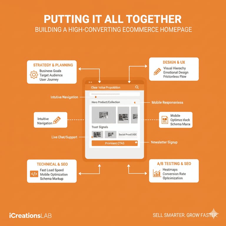
A successful ecommerce homepage design isn’t just about visual appeal—it’s about guiding your visitors through a seamless and psychologically driven shopping experience. Every element, from the hero banner to the footer, should work together to tell your brand story, build trust, and lead users naturally toward conversion.
An effective homepage design does three things simultaneously:
- Captures attention within the first 5 seconds.
- Communicates value clearly and confidently.
- Drives users toward the next action without friction.
When you combine design strategy with data-backed insights, your homepage becomes a powerful conversion engine rather than just a digital storefront.
Example Homepage Flow for Optimal Conversion
To understand how all ten elements work together, imagine this logical flow:
- Hero Banner – The First Impression
Your hero section grabs attention immediately with striking visuals and a clear CTA like “Shop the Collection.” This is where users decide whether to stay or bounce. - Value Proposition – What Makes You Unique
Below the hero image, your brand’s unique promise tells visitors exactly why they should care. Clarity here turns curiosity into interest. - Featured Products or Categories – Instant Discovery
Highlight bestsellers, trending collections, or seasonal offers to inspire browsing and reduce choice overload. - Social Proof and Trust Signals – Build Confidence
Include customer reviews, ratings, or “as seen in” logos to reinforce credibility and reduce hesitation before purchase. - Call-to-Actions (CTAs) – Direct the Journey
Strategically placed CTAs such as “Shop Now,” “Learn More,” or “View Collection” guide users step-by-step toward conversion. - Footer – Reinforce Trust and Accessibility
The footer anchors your design, offering contact info, policies, and internal links that improve usability and SEO.
When all these components align, the result is a high-performing ecommerce homepage design that not only looks great but converts consistently.
See More: How to Register a Domain Name in Singapore (2025 Guide)
Bonus Tips to Boost Your Homepage Conversion Rate
Even after you’ve implemented the 10 crucial elements, optimization never stops. The best ecommerce brands continually refine and test their homepages based on real user behavior. Here are proven strategies to elevate performance even further:
1, Use Heatmaps and User Behavior Tools
Tools like Hotjar, Crazy Egg, or Microsoft Clarity help visualize how visitors interact with your homepage. You can see where users click, how far they scroll, and where they drop off.
Why it matters:
Data-driven decisions remove guesswork. By identifying underperforming sections, you can rearrange content or reposition CTAs to capture more engagement.
Action tip:
Track scroll depth and clicks for at least two weeks before making layout changes. Small insights can yield big results.
2, Keep It Clean, Lightweight, and Fast
Performance is part of great ecommerce homepage design. Studies show that a 1-second delay in page load time can lower conversions by up to 7%.
Optimization checklist:
- Compress images with next-gen formats like WebP.
- Avoid heavy animations or autoplay videos.
- Minimize external scripts (especially third-party plugins).
- Use lazy loading for below-the-fold images.
Goal: Keep your homepage loading under 3 seconds on both desktop and mobile.
3, Update Your Homepage Regularly
Your homepage should never feel static. Seasonal updates, limited-time promotions, and new arrivals give your site a sense of activity and freshness.
Why it matters:
Returning visitors often look for something new. Updating banners, color schemes, or featured items signals that your store is alive and evolving.
Pro tip:
Plan quarterly updates around key retail seasons—like Lunar New Year, Mid-Year Sale, or Black Friday—to stay relevant and increase engagement.
4, Test Everything: A/B Testing for Continuous Growth
Even the best designs can improve with testing. A/B testing allows you to experiment with different versions of your homepage to find what performs best.
What to test:
- Headlines and subheadlines
- CTA button text and color
- Hero image variations
- Product arrangement
- Trust badge placement
Insight:
Sometimes, changing a single headline or button color can increase conversions by 10–20%. Continuous experimentation keeps your site evolving with user expectations.
See More: 7 Common Web Page Design Mistakes That Drive Visitors Away
5, Focus on Mobile UX
With mobile traffic dominating ecommerce (over 70%), mobile-first optimization is non-negotiable.
Action checklist:
- Prioritize vertical scrolling layouts.
- Ensure touch-friendly buttons and adequate spacing.
- Test on multiple screen sizes.
- Use a sticky header for faster navigation.
A flawless mobile experience builds trust and encourages impulse purchases.
6, Highlight Your Brand Story
Shoppers increasingly buy from brands that reflect their values. Use your homepage to communicate authenticity and purpose.
Ideas:
- Add a “Why We Exist” or “Our Promise” section.
- Use imagery that shows real people, not just products.
- Share your sustainability or ethical sourcing initiatives.
Emotional storytelling increases loyalty and lifetime customer value.
7, Leverage SEO for Long-Term Growth
Beyond design, your homepage should also perform well on search engines. SEO-optimized ecommerce homepage design improves visibility and attracts organic traffic.
SEO essentials:
- Use target keywords naturally in headings and meta tags.
- Include descriptive alt text for images.
- Add internal links to category pages.
- Maintain a clean URL structure (e.g., /shop, /collections, /about).
Search engines reward well-structured, fast-loading, and mobile-friendly websites—exactly the traits of a high-converting homepage.
8, Humanize the Experience with Personalization
Modern shoppers expect experiences tailored to their interests. Personalization tools use browsing history, demographics, or past purchases to display relevant content.
Examples:
- “Welcome back, Alex — here’s what’s new for you.”
- “Recommended for you” sections.
- Personalized promotions during birthdays or anniversaries.
This not only improves engagement but also builds an emotional connection that drives repeat sales.
See More: 10 Best Website Design & Development Companies 2025
Conclusion
Your eCommerce homepage is the digital front door to your brand. By mastering these 10 crucial elements, you’ll create a homepage that not only looks good but also drives measurable results.
From a powerful hero section to social proof and mobile optimization, every design choice should align with your brand promise and customer intent.
Remember: great ecommerce homepage design isn’t about decoration—it’s about direction. Guide users clearly, build trust, and conversions will follow.
8 Expert FAQs About eCommerce Homepage Design
The process of optimizing an ecommerce homepage design often raises critical questions about balance, priority, and best practices. Here are answers to eight common inquiries.
What is the most important element to place above the fold on an eCommerce homepage?
The most important element is the Unique Value Proposition (UVP), immediately reinforced by a clear, high-contrast Call-to-Action (CTA). The UVP (often in the hero section’s headline) must instantly tell visitors what you sell and why they should stay. The CTA must show them the immediate next step to purchase or discovery.
Should I use an image slider/carousel in my hero section?
Generally, no. Studies consistently show that the first slide on a carousel receives the vast majority of engagement, and subsequent slides are often missed. Carousels can also slow down page load speed and introduce too many competing messages. It is usually more effective to use one strong, static hero image or video that conveys your single, most important UVP and CTA.
How many product categories should I feature on the homepage?
You should feature your top 4 to 8 main product categories prominently. This is a balance: too few and users won’t easily find what they need; too many and the page becomes cluttered. Use your analytics data (e.g., Google Analytics) to identify the most-searched and highest-converting categories to prioritize their placement.
Is it better to focus on my best-selling products or new arrivals on the homepage?
A high-converting homepage should feature both, but in a specific order of visual hierarchy. Bestsellers should generally come first after the hero section, as they leverage social proof and are proven to convert. New Arrivals should follow to keep the store feeling fresh and encourage repeat visitors, followed by seasonal promotions or sales.
What is ‘Social Proof’ and how do I incorporate it into my design?
Social proof is the psychological phenomenon where people assume the actions of others reflect the correct behavior. In ecommerce homepage design, you incorporate it by displaying:
- Customer Reviews/Star Ratings
- Testimonials or TrustPilot scores
- “Featured In” logos (media mentions)
- Real-time sales notifications (“20 people just bought this”) These elements should be placed near featured products and high-intent areas to build immediate credibility.
How much white space is necessary for a good homepage design?
A generous amount of white space (or negative space) is crucial. White space is not ’empty’ space; it is a design element that aids readability and guides the user’s eye. Using ample white space around key elements (UVP, CTAs, product blocks) prevents visual clutter, makes the page feel premium, and improves the focus on conversion-driving elements.
Should I use a live chat widget on my homepage?
Yes, for most eCommerce businesses. A live chat widget addresses customer questions and concerns in real-time, removing immediate friction points that often lead to cart abandonment. However, ensure it is responsive, non-intrusive (doesn’t block key content), and is genuinely staffed to provide quick, helpful answers, or it can become a negative experience.
How does page load speed relate to my ecommerce homepage design?
Page load speed is directly proportional to conversion rate. A faster homepage equals more conversions. Slow loading frustrates users and is penalized by search engines (Core Web Vitals). Excellent ecommerce homepage design requires technical optimization: compressing images, minimizing code, using a CDN, and prioritizing the loading of above-the-fold content to ensure the page feels instantly responsive.