
In today’s digital economy, your website is your storefront, salesperson, and brand ambassador—all rolled into one. But here’s the truth: even if you have the best products and competitive prices, a poorly designed website can cost you thousands in lost sales.
That’s why having an eCommerce website designed for conversions isn’t optional—it’s essential. A high-converting eCommerce website not only attracts visitors but also guides them smoothly toward making a purchase.
In this guide, we’ll reveal the 10 secrets behind designing an eCommerce website that sells, based on proven strategies used by top brands worldwide.
I, Craft a Clean, User-Friendly Design
Your website’s design is the very first impression customers get of your brand. In eCommerce, that first impression is everything: if the site looks cluttered, slow, or confusing, visitors will leave within seconds—likely never to return. A clean, user-friendly design not only makes browsing enjoyable but also removes friction from the buying journey, which directly boosts conversion rates.
Why It Matters
- First impressions decide trust: A Stanford study found that 75% of users judge a company’s credibility based on its website design.
- Simplicity increases conversions: Too many colors, pop-ups, or navigation options overwhelm users and lower sales.
- Design impacts SEO: Google rewards websites with better engagement (low bounce rate, longer time on site), which clean design supports.
Key Principles of Clean Design
1, Simplicity Wins
- White space (negative space) is your friend—it draws attention to products and CTAs.
- Use a limited color palette that matches your brand identity.
- Avoid unnecessary animations or auto-play videos that distract users.
- Example: Apple’s online store—clean backgrounds, minimal text, and products at the center.
2, Logical Navigation
- Organize menus and categories so that products are easy to find.
- Example structure: Men → Shoes → Running → Lightweight.
- Add a prominent search bar with auto-suggestions.
- Use breadcrumb navigation so users always know where they are.
3, Visual Hierarchy
- Guide users’ attention with contrast: large product photos, bold pricing, and standout CTAs.
- Place the most important elements (offers, CTAs, featured products) above the fold.
- Use consistent button styles so visitors instinctively know where to click.
4, Consistency Across Pages
- Fonts, button styles, and colors should remain consistent throughout the site.
- This builds trust and creates a seamless browsing experience.
- Inconsistent design feels amateur and erodes credibility.
Pro Tips for User-Friendly Design
- Apply the “Three-Click Rule”: Users should be able to find any product in three clicks or less.
- Design for scanning, not reading: Use short paragraphs, bullet points, and bold highlights.
- Prioritize accessibility: Ensure contrast ratios, alt text, and keyboard navigation for users with disabilities.
- Test with real users: Run usability tests to see where customers struggle, then refine.
Extra Value: Mobile-First Focus
A user-friendly design must work across devices:
- Ensure CTAs are thumb-friendly on mobile.
- Optimize menus for small screens (hamburger menus are common).
- Compress images so they load fast even on slower mobile networks.
Example: Fashion retailer Zara keeps its design minimal, with high-quality visuals and intuitive navigation, making shopping easy on both desktop and mobile.
See More: Website UI Design Explained: 4 Golden Rules for a Stunning & User-Friendly Interface
II, Optimize for Mobile-First Experiences

Today, more than 70% of eCommerce traffic comes from smartphones. For many industries—like fashion, food delivery, and travel—mobile accounts for over 80% of total sessions. This means a desktop-first approach is outdated. If your eCommerce website isn’t designed with mobile-first principles, you’re losing customers every single day.
Why Mobile Optimization Matters
- User Behavior: Shoppers research, compare, and purchase directly from their phones.
- Google’s Mobile-First Indexing: Since 2019, Google predominantly uses the mobile version of a site for ranking and indexing.
- Conversions at Risk: Research shows that 53% of mobile users abandon sites that take longer than 3 seconds to load.
In short, mobile optimization isn’t an option—it’s a survival requirement.
Core Principles of Mobile-First eCommerce
1, Responsive Design
- The website layout should adapt seamlessly to different screen sizes (phones, tablets, desktops).
- Avoid horizontal scrolling and oversized elements.
- Use flexible grids, scalable images, and fluid typography.
- Example: Nike’s online store ensures product visuals remain high-quality across all devices.
2, Prioritize Speed
- Every extra second of load time reduces conversion rates by up to 7%.
- Optimize images with modern formats like WebP.
- Minimize JavaScript and CSS bloat.
- Use a Content Delivery Network (CDN) to speed up global access.
- Example: Walmart reported a 2% increase in conversions for every 1-second improvement in load speed.
3, Thumb-Friendly CTAs and Navigation
- Place buttons where thumbs naturally reach (bottom-center of the screen).
- Make CTAs large enough (at least 44px height recommended by Google).
- Use sticky “Add to Cart” or “Buy Now” buttons so users don’t need to scroll back up.
- Simplify menus with collapsible navigation.
4, Streamlined Checkout on Mobile
- Offer guest checkout to reduce friction.
- Integrate mobile wallets like Apple Pay, Google Pay, PayPal.
- Auto-fill shipping and billing details where possible.
- Example: Amazon’s one-tap checkout sets the gold standard for seamless mobile experiences.
Pro Tips for Mobile Optimization
- Use Google’s Mobile-Friendly Test to identify issues.
- Monitor Core Web Vitals (LCP, FID, CLS) for mobile performance in Google Search Console.
- Consider progressive web apps (PWAs) for app-like performance without forcing users to download an app.
- Test design on multiple devices and screen resolutions, not just iPhone/Android defaults.
See More: The Complete Guide to On-Page SEO Optimization in 2025
III, Showcase High-Quality Product Images and Videos
One of the biggest challenges in eCommerce is that customers cannot physically touch or try products. That’s why visuals become your most powerful sales tool. Clear, engaging, and persuasive product imagery not only helps customers make better decisions but also builds trust and reduces hesitation.
Why Visuals Matter
- First impressions: 93% of consumers say visual appearance is a key factor in purchase decisions.
- Trust & credibility: Grainy, low-quality photos make products look cheap and unreliable.
- Engagement & conversions: Shoppers who watch product videos are up to 85% more likely to purchase.
Key Visual Strategies for eCommerce
1, Multiple Angles
- Show every angle of the product so shoppers feel like they are holding it in their hands.
- Include close-ups of textures, materials, and key details.
- For apparel, show front, back, side, and fit on a model.
Example: IKEA’s product pages display wide shots, detail shots, and room-setting images.
2, Zoom-In Features
- Allow customers to inspect fine details such as stitching, fabric quality, or packaging.
- Zoom should be crisp and fast-loading, not blurry.
Pro Tip: Pair zoom features with high-resolution photography for maximum effect.
3, Product Videos
- Demonstrate how products work in real life.
- For clothing: short runway-style clips showing fit and movement.
- For electronics: tutorials or unboxing videos.
- Adding videos can boost conversion rates by up to 80%.
Example: ASOS uses short videos to show how clothes look in motion, reducing return rates.
4, Lifestyle Photography
- Show the product being used in real-life scenarios.
- Helps customers imagine how it will fit into their lifestyle.
- Example: A coffee machine shown on a cozy kitchen counter rather than a plain white background.
5, 360-Degree Views and AR (Augmented Reality)
- Let users rotate the product or visualize it in their own space.
- Brands like Wayfair and IKEA use AR to let customers place furniture virtually in their rooms.
Visual Optimization for SEO & UX
- Alt Text: Always add descriptive alt text to images for SEO and accessibility.
- Image Compression: Balance high resolution with fast load times using formats like WebP.
- Consistent Style: Maintain uniform lighting, backgrounds, and image sizes across products for a professional feel.
- Accessibility: Ensure videos have captions and images include descriptions for visually impaired users.
Pro Tips
- Use A/B testing to see whether lifestyle photos or plain product shots convert better for your audience.
- Add customer-generated photos or videos for extra credibility (UGC).
- Place your best product image as the default thumbnail to grab attention instantly.
See More: Website UI Design Explained: 4 Golden Rules for a Stunning & User-Friendly Interface
IV, Write Persuasive, Benefit-Driven Copy
In eCommerce, words matter just as much as visuals. While images catch the eye, it’s the copy that convinces customers to take action. A poorly written product description can confuse or bore readers, but a persuasive, benefit-driven copy makes them feel they need your product.
Why Benefits Sell More Than Features
- Features tell what the product is.
- Benefits tell what the product does for the customer.
- Customers don’t buy products—they buy solutions to their problems or ways to improve their lives.
Example:
- Feature: “This blender has a 1200W motor.”
- Benefit: “Blend smoothies in seconds with a powerful 1200W motor—perfect for busy mornings.”
See the difference? One is technical, the other connects emotionally to the customer’s daily life.
Techniques for Persuasive Copy
1, Use the FAB Framework (Features → Advantages → Benefits)
- Feature: “Laptop with 16GB RAM.”
- Advantage: “Handles multiple apps without slowing down.”
- Benefit: “Work faster and stress-free, even with dozens of tabs open.”
2, Incorporate Power Words
Words like proven, exclusive, limited, guaranteed, effortless trigger emotions and urgency.
Example: “Get exclusive access to our proven skincare formula—available only this season.”
3, Keep It Scannable
Online shoppers skim. Break text into bullet points, highlight key benefits, and use short paragraphs.
4, Address Objections
Preempt customer concerns directly in the copy.
Example: “Worried about fit? Enjoy free 30-day returns, no questions asked.”
Examples of Benefit-Driven Copy
- Apple (MacBook Air): “Power. It’s in the Air.” → Focuses on performance and portability, not just specs.
- Dollar Shave Club: “Shave Time. Shave Money.” → Short, clever, and benefit-focused.
- Nike: “Run faster, push further, break limits.” → Emotional and aspirational.
Pro Tips for Writing High-Converting Copy
- Write like you’re speaking directly to one customer (“you,” “your life”).
- Use storytelling—show how the product transforms the customer’s situation.
- Place the strongest benefit in the first sentence to grab attention.
- Test different tones: conversational vs. professional, short vs. detailed.
See More: Can ChatGPT Help You Create a Modern Website in 2025?
V. Build Trust with Social Proof

In eCommerce, trust is currency. Since shoppers can’t physically touch your products, they rely on the experiences of others to make purchasing decisions. That’s where social proof comes in. It reassures potential buyers that they’re making the right choice—because others already have.
Why Social Proof Matters
- 88% of consumers trust online reviews as much as personal recommendations (BrightLocal).
- Products with five or more reviews are 270% more likely to be purchased than those with none (Spiegel Research).
- Social proof reduces buyer hesitation, increases conversions, and builds long-term credibility.
Types of Social Proof for eCommerce
1, Customer Reviews & Ratings
- Display reviews prominently on product pages.
- Include both positive and constructive reviews—this adds authenticity.
- Use rating summaries (e.g., ★ 4.8 out of 5 from 2,315 reviews).
- Add “Verified Purchase” tags for credibility.
Pro Tip: Place best reviews near CTAs (e.g., “Add to Cart”) to reinforce buying decisions.
2, User-Generated Content (UGC)
- Encourage customers to share photos/videos of themselves using your products.
- Showcase UGC on product pages, social media feeds, or even in email marketing.
- This creates community-driven marketing, turning customers into ambassadors.
Example: Fashion brand Glossier built its empire by encouraging users to post selfies with their skincare and makeup products.
3, Trust Badges & Certifications
- Highlight secure payment logos (Visa, Mastercard, PayPal).
- Display SSL certificates, “100% Money-Back Guarantee,” or “Free Returns” badges.
- Include third-party certifications (organic, cruelty-free, fair trade, etc.) if relevant.
Why it works: These small signals instantly reduce risk perception at checkout.
4, Case Studies & Testimonials
- Share detailed stories of how your product solved a customer’s problem.
- Include customer names, locations, or company logos to add authenticity.
- Video testimonials are especially powerful—seeing real people boosts relatability.
5, Influencer & Expert Endorsements
- Collaborate with influencers relevant to your niche.
- Expert or celebrity endorsements add authority and expand reach.
- Even micro-influencers can have higher trust within small communities.
Example: Gymshark leveraged fitness influencers to rapidly grow its global fan base.
6, Numbers & Statistics as Social Proof
- Show the scale of adoption: “Trusted by 50,000+ happy customers.”
- Highlight trending products: “1,200 people bought this item in the last 24 hours.”
- Use scarcity psychology: “Only 5 left in stock!”
Pro Tips to Leverage Social Proof Effectively
- Automate collection: Use post-purchase emails to request reviews.
- Incentivize UGC: Offer discounts or loyalty points for sharing photos.
- Show diversity: Display a mix of different customer profiles for relatability.
- Update regularly: Outdated reviews (e.g., 2 years old) weaken credibility.
See More: Website Design Price Guide 2025 | How Much Does It Really Cost?
VI. Simplify the Checkout Process
One of the biggest leaks in the eCommerce sales funnel happens at checkout. Studies show that the average cart abandonment rate is nearly 70% (Baymard Institute). The number one reason? Complicated or frustrating checkout experiences. Every additional step, form field, or delay increases the chances of losing a sale.
A streamlined, frictionless checkout experience is critical for turning browsers into buyers.
Key Elements of a High-Converting Checkout
1, Guest Checkout Option
- Forcing users to create an account increases abandonment.
- Offer guest checkout and invite them to create an account after purchase.
- This reduces friction and keeps the buying process smooth.
Example: Nike allows shoppers to checkout as guests, but offers perks of creating an account post-purchase (loyalty points, faster reorders).
2, One-Page or Minimal-Step Checkout
- Multi-step checkouts feel tedious and confusing.
- A one-page layout where billing, shipping, and payment details are filled on a single screen keeps it efficient.
- If multiple steps are required, use a progress bar so customers know exactly where they are.
Example: Shopify’s checkout uses a clean step-by-step process with clear progress indicators.
3, Multiple Payment Methods
- Customers expect flexibility in payment.
- Provide major credit/debit cards, PayPal, Apple Pay, Google Pay, and BNPL (Buy Now Pay Later) options like Klarna or Afterpay.
- Local payment gateways (Alipay, Momo, etc.) can significantly increase conversions in regional markets.
Stat: According to Klarna, 44% of online shoppers are more likely to buy if BNPL options are available.
4, Progress Indicators
- Show users where they are in the checkout process.
- Example: Step 1: Shipping → Step 2: Payment → Step 3: Review Order.
- This transparency reduces uncertainty and lowers abandonment.
5, Optimize Form Design
- Keep forms short—ask only for essential information.
- Enable auto-fill for shipping and billing details.
- Use inline validation to catch errors before submission.
Pro Tips to Reduce Cart Abandonment
- Exit-Intent Popups: When users move to close the page, trigger a popup with a discount code or free shipping.
- Cart Recovery Emails: Send automated reminders with incentives to complete the purchase.
- Save Cart Feature: Let users return later without losing items.
- Trust Elements: Display security badges and return policies near the checkout button to build confidence.
See More: WordPress Website Design Hacks for a High-Impact 2025 Website
VII. Speed Up Website Performance
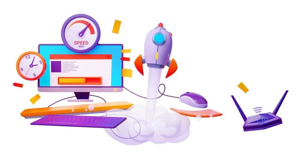
In eCommerce, every second counts. A slow-loading website not only frustrates visitors but also directly reduces sales. According to Google, 53% of mobile users abandon a site if it takes more than 3 seconds to load. Even a 1-second delay can reduce conversions by up to 7%.
Speed is not just a user experience issue—it’s a sales and SEO issue. Google’s Core Web Vitals now use site speed as a ranking factor, meaning a slow website could also hurt your organic visibility.
Why Website Speed Matters
- Conversions: Walmart found that improving load time by 1 second increased conversions by 2%.
- Customer Retention: 79% of online shoppers say they won’t return to a website with poor performance.
- SEO Rankings: Faster sites rank higher because Google prioritizes websites that provide better user experience.
Strategies to Improve Website Speed
1, Use a Content Delivery Network (CDN)
- Distributes your content across global servers so users load data from the nearest server.
- Reduces latency and improves performance worldwide.
- Providers: Cloudflare, Akamai, Amazon CloudFront.
2, Compress and Optimize Images
- Large images are one of the biggest speed killers.
- Use next-gen formats like WebP for smaller file sizes without quality loss.
- Tools: TinyPNG, ImageOptim, or built-in compression in Shopify/WordPress plugins.
3, Optimize Code and Scripts
- Minify HTML, CSS, and JavaScript to remove unnecessary characters.
- Defer non-essential scripts (like chat widgets or social media feeds) so they load after the main content.
- Use lazy loading for images and videos to improve first-page load speed.
4, Choose a Fast, Reliable Hosting Service
- Shared hosting may be cheap but often results in slower speeds.
- Consider cloud hosting (AWS, Google Cloud, DigitalOcean) or optimized eCommerce hosting (Shopify, BigCommerce).
- Ensure hosting supports HTTP/2 or HTTP/3 for faster connections.
Pro Tips for Performance Optimization
- Enable Browser Caching: Store assets locally on user devices to reduce reload times.
- Use AMP (Accelerated Mobile Pages): Especially for content-heavy eCommerce blogs.
- Monitor Core Web Vitals: Track LCP (Largest Contentful Paint), FID (First Input Delay), and CLS (Cumulative Layout Shift) in Google Search Console.
- Regular Speed Testing: Use tools like GTmetrix, Pingdom, or Google PageSpeed Insights.
Example: Walmart
Walmart discovered that for every 1 second improvement in page load time, they saw a 2% increase in conversions. This illustrates how speed enhancements directly translate into revenue growth.
- Use Clear and Compelling Calls-to-Action (CTAs)
Your Call-to-Action (CTA) is where interest turns into sales. It’s the moment you tell customers exactly what to do next—add to cart, sign up, or complete a purchase. Weak CTAs like “Submit” or “Click Here” fail to inspire action. Strong CTAs, on the other hand, are direct, persuasive, and benefit-driven, leading to significant increases in conversions.
Why CTAs Matter
- Guide users: Without a clear CTA, shoppers don’t know what the next step is.
- Boost conversions: A study by Unbounce found that optimized CTAs can improve conversions by up to 90%.
- Reduce friction: Clear language eliminates hesitation and builds confidence.
Characteristics of a High-Converting CTA
1, Action-Focused Wording
- Strong CTAs use command verbs that push the shopper to act.
- Examples: “Add to Cart,” “Get My Discount,” “Buy Now,” “Download Free Guide.”
2, Benefit-Driven Messaging
- Instead of generic text, emphasize the outcome or reward.
- Weak: “Start Free Trial.”
- Strong: “Start Saving with Your Free Trial Today.”
- Stronger: “Grow Your Sales—Start Free Trial Today.”
3, Visual Contrast
- CTAs must stand out from the rest of the page.
- Use bold, contrasting colors (e.g., orange, green, red) that align with your brand but still draw attention.
- Ensure buttons are large enough for mobile users (at least 44px).
4, Strategic Placement
- Place primary CTAs above the fold so they’re visible immediately.
- Repeat CTAs on long product pages for users who scroll.
- Use sticky CTAs (e.g., “Add to Cart” floating button on mobile) for constant accessibility.
Pro Tips to Optimize CTAs
- A/B Test Variations: Test different wording, colors, and placements. Sometimes changing one word boosts conversions.
- Create Urgency & Scarcity: Add phrases like “Limited Stock” or “Offer Ends Soon” to nudge faster decisions.
- Match CTA with Funnel Stage:
- Early stage: “Learn More” or “See How It Works.”
- Decision stage: “Buy Now” or “Get Started.”
- Personalize When Possible: Example: “Yes, I Want My Discount!” instead of just “Get Discount.”
Examples of Effective CTAs
- Amazon: “Add to Cart” and “Buy Now with 1-Click” reduce friction and create urgency.
- Dropbox: “Find the Right Plan for You” makes the CTA personal and helpful.
- Glossier: “Shop the Edit” feels stylish, aligning with brand identity.
IX. Personalize the Shopping Experience
In modern eCommerce, one-size-fits-all no longer works. Shoppers expect a tailored journey that reflects their interests, behaviors, and preferences. In fact, studies show that personalization can boost sales by 20% or more and improve customer loyalty significantly.
When your eCommerce website delivers relevant product suggestions, personalized offers, and customized communication, customers feel understood—and are far more likely to buy.
Why Personalization Matters
- Higher Conversions: Personalized product recommendations account for up to 31% of eCommerce revenues (Barilliance).
- Customer Loyalty: 80% of shoppers are more likely to buy from brands that offer a personalized experience (Epsilon).
- Reduced Cart Abandonment: Personalized reminders bring customers back to complete purchases.
Key Personalization Strategies
1, Dynamic Recommendations
- Suggest products based on user behavior, browsing history, and past purchases.
- Examples: “You may also like”, “Frequently bought together”, or “Customers who viewed this also bought.”
- Helps increase average order value (AOV) by encouraging add-ons or bundles.
Example: Amazon perfected upselling with “Frequently Bought Together” suggestions, driving billions in extra revenue.
2, Personalized Emails
- Send cart abandonment emails with the exact items left behind.
- Recommend products based on browsing behavior (“Since you liked X, you may enjoy Y”).
- Offer birthday discounts or loyalty perks for returning customers.
Pro Tip: Personalized subject lines increase open rates by 26%.
3, Behavior-Based Targeting
- Show different homepage banners depending on user location, device, or referral source.
- Example: Display “Free Shipping in California” for visitors browsing from California.
- Use browsing data to tailor offers: if a customer repeatedly views running shoes, highlight discounts on related products.
4, On-Site Personalization Tools
- Use AI-powered engines to adapt product recommendations in real time.
- Implement dynamic search bars with autocomplete tailored to each user.
- Example: Netflix personalizes recommendations for every viewer—apply the same logic to product discovery.
Advanced Personalization Tactics
- Segmentation: Group customers by demographics, purchase behavior, or interests.
- Loyalty Tiers: Reward returning customers with exclusive offers.
- Geo-Targeting: Adjust currency, language, or promotions based on location.
- Predictive Analytics: Use AI to predict what customers want before they search for it.
X. Leverage Analytics and A/B Testing
A high-converting eCommerce website isn’t built on assumptions—it’s built on data-driven decisions. Without analytics, you’re essentially guessing what works and what doesn’t. By tracking user behavior and running systematic tests, you gain insights that reveal exactly how to optimize your website for more sales.
Why Analytics and Testing Are Crucial
- Identify friction points: Analytics shows where shoppers drop off in the funnel.
- Measure what matters: Conversion rate, bounce rate, session duration, and cart abandonment give you the full picture of performance.
- Maximize ROI: Small adjustments backed by data can deliver double-digit increases in conversions.
- Reduce risk: Instead of redesigning blindly, A/B testing proves what changes actually work.
Key Tools for Smarter Optimization
1, Google Analytics 4 (GA4)
- Tracks conversions, bounce rates, user flow, and revenue attribution.
- Offers cross-device tracking, giving a holistic view of the customer journey.
- AI-powered predictive metrics help forecast potential revenue and churn risk.
Example: Using GA4, you might discover that 40% of users abandon carts on the shipping page—clear evidence you need to simplify shipping options.
2, A/B Testing
- Test one element at a time: headlines, CTAs, product descriptions, page layouts, or pricing strategies.
- Measure performance (conversion rate, click-through rate, revenue per visitor).
- Use tools like Optimizely, Google Optimize, or VWO.
Example: Changing CTA wording from “Submit” to “Get My Free Quote Today” boosted conversions by 27% in a HubSpot test.
3, Heatmaps and Session Recordings
- Tools like Hotjar or CrazyEgg show where users click, scroll, or drop off.
- Heatmaps visualize “hot zones” (popular areas) and “cold zones” (ignored elements).
- Session recordings let you watch real customer interactions, uncovering UX problems.
Example: A heatmap may reveal users rarely scroll past the first screen—suggesting your key CTA should be placed higher.
Pro Tips for Effective Testing
- Start with hypotheses: Don’t test randomly. Define why you’re testing and what you expect.
- Test one variable at a time: Changing multiple elements confuses results.
- Run tests long enough: Collect statistically significant data before making decisions.
- Iterate constantly: Optimization is an ongoing process, not a one-time project.