
When someone visits your website, the first impression comes from UI design. A well-crafted website UI design not only makes your site look stunning but also ensures that visitors can easily navigate, engage, and take action. For businesses in Singapore, where digital competition is intense, investing in professional UI design is no longer optional – it’s essential.
What is Website UI Design?

Website UI (User Interface) design refers to the practice of crafting the visual and interactive layer of a website—the part that users actually see and interact with. It covers elements such as buttons, navigation menus, typography, icons, forms, imagery, and overall page layout.
A strong UI design ensures that all these components work together seamlessly to provide a smooth and intuitive experience. For example:
- A clear navigation bar helps users find information quickly.
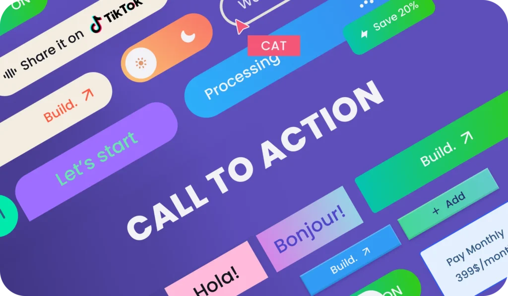
- Well-placed call-to-action (CTA) buttons encourage users to take the next step, such as requesting a quote or making a purchase.
- Consistent typography and color palettes reinforce brand identity and professionalism.
Unlike UX (User Experience) design, which deals with the broader journey and satisfaction of users, UI focuses on the “look and feel” of the site—how attractive, intuitive, and engaging the interface appears at first glance. In practice, UI is the gateway to UX: even if the user journey is well-structured, poor UI can discourage users from exploring further.
See More: Can ChatGPT Help You Create a Modern Website in 2025?
Why is UI Design Important for Business?

For businesses, a website is often the first touchpoint with potential customers. The quality of UI design can determine whether visitors stay and explore—or leave within seconds. Investing in a well-designed UI brings several tangible benefits:
1, Builds Trust and Credibility
A polished and professional interface immediately signals reliability. In markets like Singapore, where customers compare multiple providers online, an outdated or clunky design can make your business appear less trustworthy.
2, Creates a Smooth Navigation Flow
Good UI eliminates friction. Intuitive menus, logical page hierarchies, and responsive design ensure users can quickly find what they need, whether they’re browsing on desktop or mobile. This reduces bounce rates and keeps visitors engaged longer.
3, Improves Conversion Rates
Strategic UI design guides users toward desired actions—filling out a form, booking a consultation, or completing a purchase. Thoughtful placement of CTAs, clear messaging, and visually distinct buttons help turn visitors into paying customers.
4, Enhances Brand Identity
UI is not just about usability; it’s also about branding. Colors, typography, and imagery aligned with your brand identity create consistency across all digital touchpoints. This strengthens brand recall and differentiates your business from competitors.
5, Supports SEO and Digital Marketing
While search engines don’t rank websites directly on aesthetics, a user-friendly interface improves engagement metrics—such as dwell time and page views—that indirectly boost SEO performance.
In short: UI design is a business investment. A great-looking website that is easy to navigate not only leaves a strong impression but also directly impacts sales, customer loyalty, and long-term growth.
See More: Website Design Price Guide 2025 | How Much Does It Really Cost?
4 Golden Rules of Website UI Design
Consistency – Use the same fonts, colors, and components across all pages.
Consistency is one of the most fundamental principles of effective Website UI Design. It means maintaining a uniform style and behavior across every page of your website so that users experience a sense of familiarity and predictability while navigating.
When a website lacks consistency—different fonts on each page, random button styles, or changing color palettes—users feel disoriented. They may even perceive the business as unprofessional or unreliable. By contrast, a consistent interface builds trust, comfort, and brand recognition.
Key Areas of Consistency:
1, Typography
A good website UI should use a defined set of fonts, typically one or two families, to maintain visual harmony. Headings, body text, and call-to-action buttons need to follow a consistent sizing and hierarchy so users can easily scan and understand the content. This approach not only improves readability but also reinforces brand identity, making the website look more professional and trustworthy.
2, Color Palette
When designing a website UI, it’s important to stick to a primary brand color, along with secondary and accent colors that complement it. These colors should be applied consistently across backgrounds, links, and interactive elements to create a cohesive look and feel. For example, your main call-to-action (CTA) button should always use the same highlight color, allowing users to instantly recognize where to click and reinforcing your brand identity at the same time.
3, UI Components
Buttons, forms, icons, and navigation menus should maintain a consistent look and behavior across every page of the website. If a “Submit” button is blue on one page, it should not suddenly appear in green or with a different shape on another, as this can confuse visitors. By keeping these UI components uniform, you reduce the learning curve for users, making interactions more intuitive and building trust in your website’s professionalism.
4, Layout & Structure
A well-designed website should reuse the same grid systems, spacing, and alignment to maintain visual harmony. Elements like the header, footer, and sidebar should also remain consistent across all pages so that users always know where to find key information. When page layouts follow a familiar rhythm, visitors feel more confident and comfortable navigating the site, which leads to a smoother user experience and stronger trust in your brand.
Benefits of Consistency in UI Design:
- Enhances Usability: Users don’t need to relearn how to interact with each page.
- Builds Trust & Professionalism: A polished, uniform look gives the impression of a well-managed brand.
- Improves Brand Recognition: Repeated exposure to the same fonts, colors, and styles strengthens your brand identity.
- Reduces Cognitive Load: The brain processes familiar patterns faster, allowing users to focus on content and actions instead of figuring out how the site works.
In short, consistency makes your website intuitive, professional, and memorable. It’s not just about aesthetics—it directly impacts how smoothly users interact with your brand online.
Simplicity – Keep layouts clean; avoid unnecessary clutter.
In website UI design, simplicity is power. A clean, uncluttered layout allows users to quickly understand your content, focus on what matters, and take action without confusion. Too many design elements, pop-ups, or competing visuals can overwhelm visitors, making them leave before exploring your site.
How to Apply Simplicity in UI Design:
1, Clear Visual Hierarchy
When structuring your content, make sure the most important information stands out clearly to users. Using headings, subheadings, and adequate whitespace helps guide the eye naturally through the page, allowing visitors to absorb key points without feeling overwhelmed. For example, you might place a bold headline at the top, follow it with concise supporting text, and then position a clear call-to-action button that directs users toward the next step.
2, Minimalist Layouts
Every element on a webpage should serve a clear purpose in guiding users or enhancing their experience. To achieve this, it’s important to remove distractions such as excessive banners, unnecessary animations, or irrelevant stock images that add no real value. In UI design, less is often more—a few well-placed visuals can deliver far greater impact than a cluttered interface filled with competing graphics.
3, Whitespace (Negative Space)
Allowing sufficient breathing room between sections, text blocks, and buttons is essential for creating a comfortable reading and browsing experience. This effective use of whitespace not only improves readability but also reduces cognitive load, helping users process information more easily. At the same time, it gives your website a clean, modern, and professional appearance that reflects well on your brand.
4, Simple Navigation
Menus should always be straightforward and easy to understand, with clear labels that immediately tell users where each option will take them. Overloading visitors with too many menu items or complex dropdowns can create confusion and frustration, so it’s best to keep navigation limited to the most essential categories. By guiding users step by step through a simple and logical menu structure, you make it easier for them to find what they need and stay engaged with your website.
5, Concise Content
When creating website content, focus on writing short and impactful sentences that deliver your message quickly. Complex information should be broken down into bullet points or supported with icons so that users can grasp the key ideas at a glance. Since most visitors scan a webpage before deciding whether to read in detail, making your content easy to digest ensures they stay engaged and find the information they need without effort.
Benefits of Simplicity in UI Design:
- Improves User Experience: Visitors find what they need faster, leading to greater satisfaction.
- Increases Conversions: Clean layouts highlight CTAs and direct attention where it matters.
- Boosts Professionalism: A simple, modern design feels more trustworthy and premium.
- Mobile-Friendly: Simpler designs adapt better to smaller screens, ensuring smooth experiences across devices.
In short, simplicity removes noise and amplifies clarity. It ensures your website feels intuitive, professional, and customer-focused—qualities that directly influence business success.
See More: WordPress Website Design Hacks for a High-Impact 2025 Website
Feedback – Provide clear signals (hover effects, success messages).

Feedback in website UI design is all about communication between the system and the user. Every action a visitor takes on your site—whether it’s clicking a button, submitting a form, or hovering over a link—should trigger a clear response. Without feedback, users may feel uncertain or think the website is broken.
Think of UI feedback as a two-way conversation: the user acts, the system responds.
How to Apply Feedback in UI Design:
1, Hover Effects
- Buttons or links should change color, size, or display an effect when hovered.
- Example: A “Buy Now” button turning from grey to blue when hovered shows it’s clickable.
- This instant feedback reassures users that their cursor is in the right place.
2, Loading Indicators
- Use spinners, progress bars, or “loading…” messages when pages or forms are processing.
- This prevents users from clicking multiple times or abandoning the action out of frustration.
3, Success & Error Messages
- When users complete an action (like signing up), show a clear confirmation message such as “Thank you, your submission was successful.”
- If an error occurs, guide them with helpful feedback: “Your password must include at least 8 characters.”
- Avoid vague messages like “Error!” which only confuses users.
4, Interactive Animations
- Small animations (like a checkmark appearing after ticking a box) give users visual confirmation.
- Subtle effects are best—too much animation can feel distracting.
5, Notifications & Alerts
- Use pop-up banners or inline alerts for important updates, but keep them concise.
- Example: “Your cart has been updated” after adding a product.
Benefits of Effective Feedback in UI:
- Builds User Confidence: Users know their actions are being registered.
- Reduces Errors: Clear guidance helps users correct mistakes quickly.
- Improves Flow: Smooth interaction keeps visitors engaged instead of confused.
- Enhances Professionalism: A responsive site feels polished and reliable.
In short, feedback removes uncertainty. It reassures visitors, improves usability, and makes interactions with your website feel natural and effortless.
See More: Website Design for Small Business: 7 Secrets to Boost Sales Instantly
User Control – Ensure easy navigation, back options, and responsive design.
One of the most important principles in website UI design is giving users a sense of control. Visitors should feel they can easily navigate your site, make choices, and correct mistakes without feeling stuck or forced down a path they don’t want. When users are in control, they feel more comfortable, engaged, and willing to interact with your brand.
How to Apply User Control in UI Design:
1, Easy Navigation
Menus should be clear, visible, and consistent across all pages so that users always know how to navigate your site. Adding breadcrumbs is also helpful, as it shows visitors exactly where they are in the site structure and allows them to return to previous sections effortlessly. To further improve usability, a fixed header or sticky navigation bar ensures that key pages remain accessible at all times, even when users scroll down long pages.
2, Back & Undo Options
A good UI should always give users the ability to go back to the previous step without losing their progress. For example, in a multi-step checkout process, customers should be able to return to an earlier step to make changes without having to start over from the beginning. Wherever possible, provide clear “Cancel” or “Undo” options so users never feel trapped in irreversible actions. This sense of flexibility builds confidence and makes the overall experience far more user-friendly
3, Responsive Design
To deliver a smooth user experience, your website should adapt seamlessly to all devices—desktop, tablet, and especially mobile. Interactive elements like buttons need to be large enough for comfortable touch interactions on smaller screens, while forms and images should resize intelligently to fit without requiring users to scroll excessively or zoom in and out. A responsive design not only improves usability but also ensures consistency across platforms, making your website accessible and enjoyable for every visitor.
4, Clear Calls to Action (CTAs)
- Let users decide their next step with obvious, well-placed CTAs.
- Avoid dark patterns (tricking users into clicking something they didn’t intend). Transparency builds trust.
5, Personalization & Flexibility
Giving users the ability to adjust preferences—such as selecting their preferred language or switching between dark and light mode—helps create a more personalized experience. In addition, offering multiple contact or purchase options ensures that users can interact with your business in the way that suits them best, whether through email, phone, live chat, or different payment methods. This flexibility not only enhances convenience but also builds trust by showing respect for user choice.
Benefits of User Control in UI Design:
- Reduces Frustration: Users feel safe knowing they can backtrack or change their choices.
- Increases Engagement: Visitors are more likely to explore when they can freely move around.
- Boosts Conversions: A smooth, flexible journey lowers drop-offs during sign-up or checkout.
- Builds Trust: Transparent navigation and flexible options show respect for the user’s decisions.
In short, User Control empowers visitors. It makes them feel comfortable, prevents frustration, and creates a positive interaction that builds long-term trust with your brand.
What makes a good website UI?
A good website UI is one that strikes the perfect balance between aesthetics and usability. While an attractive interface immediately captures attention, the real measure of success is how easily visitors can interact with the site and accomplish their goals.
A strong UI design should include:
1, Clear Navigation – Menus, buttons, and links must be easy to find and logically structured, so users never feel lost.
2, Readable Typography – Fonts should be consistent, properly sized, and optimized for both desktop and mobile viewing.
3, Consistent Color Schemes – A defined palette that reflects your brand identity and creates visual harmony across all pages.
4, Intuitive Layouts – Content should be arranged in a way that naturally guides the eye toward important sections and calls to action.
5, Interactive Feedback – Hover effects, clickable buttons, and confirmation messages reassure users that their actions are being recognized.
6, Mobile Responsiveness – A good UI must adapt seamlessly to different devices, ensuring the same quality experience on desktop, tablet, and mobile.
In essence, a good website UI is not just beautiful—it’s functional, intuitive, and aligned with business goals. It helps visitors move smoothly through their journey, whether that’s exploring products, filling out a form, or completing a purchase.
See More: How Professional Website Design Boosts SEO Rankings
UI vs UX – What’s the Difference?

Although UI (User Interface) and UX (User Experience) are often mentioned together, they represent two distinct but closely connected aspects of web design.
- UI (User Interface) focuses on the visual design elements of a website—such as colors, typography, buttons, icons, spacing, and overall aesthetics. UI determines how the site looks and how users interact with each element visually. For example, the design of a “Sign Up” button or the layout of a product page belongs to UI.
- UX (User Experience) is broader and refers to the entire journey a user takes when interacting with a website. It covers ease of navigation, clarity of content, page loading speed, and the overall satisfaction users feel while trying to achieve their goals. For instance, how quickly a customer can find a product, add it to the cart, and complete checkout is part of UX.
In short: UI is the “look” and UX is the “feel.”
- A website may look stunning (good UI) but if it’s difficult to use, customers will leave (poor UX).
- Likewise, a site may have a smooth user flow (good UX) but if it looks outdated or unprofessional, it won’t build trust (poor UI).
How Does UI Impact SEO?
While UI design itself is not a direct ranking factor in Google’s algorithm, it has a powerful indirect impact on SEO through the way users interact with your website. Search engines measure user behavior, and a strong UI design leads to positive signals that improve rankings over time.
Here’s how UI influences SEO:
1, Improved Readability
- Clean typography, proper font sizes, and balanced spacing make content easy to consume.
- When users can quickly understand your message, they stay longer, lowering bounce rates.
2, Smooth Navigation
- A consistent menu structure, clear internal links, and logical page hierarchy guide users effortlessly.
- This not only keeps visitors engaged but also helps Google crawl and index your site more effectively.
3, Higher Engagement
- Interactive UI elements—such as hover effects, clickable CTAs, and intuitive layouts—encourage users to explore multiple pages.
- The result: increased session duration and page views per visit, both of which are positive SEO signals.
4, Mobile Responsiveness
- A responsive UI ensures your website adapts seamlessly to mobile, tablet, and desktop.
- Since mobile-first indexing is a priority for Google, a poor mobile UI can directly hurt your rankings.
5, Reduced Bounce Rate
- A confusing or cluttered interface drives users away quickly.
- By contrast, a clean and intuitive UI makes visitors comfortable, encouraging them to continue their journey on your site.
In summary: Good UI boosts SEO indirectly by enhancing user experience. When people stay longer, engage more, and return to your website, Google interprets it as a sign of quality—rewarding you with better search visibility.
Website UI Design in Singapore – iCreationsLAB
At iCreationsLAB, we deliver modern, SEO-friendly website UI design tailored for businesses in Singapore. Our team ensures your website is not only visually appealing but also optimized for conversions.
+ Office Address: 190 Woodlands Industrial Park E5, #07-08, Woodlands BizHub, Singapore 757516
+ Phone: +65 6269 9558 (Mon – Fri / 10am – 6pm)
+ Email: [email protected]
Ready to elevate your digital presence? Contact iCreationsLAB today for a free consultation on website UI design.
FQA
How can I ensure my UI design adheres to the ‘less is more’ principle
To ensure your UI design adheres to the “less is more” principle, focus on minimalist strategies that prioritize user experience and clarity:
- Prioritize Essentials: Only include elements and features that are absolutely necessary for users to achieve their goals. Remove anything that does not serve a clear purpose or enhance functionality.
- Maximize Negative Space: Use whitespace effectively to separate content, create breathing room, and avoid clutter. This helps users focus and prevents overwhelming them with too many visual stimuli.
- Simplify Visual Hierarchy: Clearly emphasize key actions (such as CTAs) through size, contrast, and placement. Use subtle hierarchies so users naturally flow through your interface.
- Embrace Consistency: Use consistent colors, typography, and repeat navigation patterns throughout your design. Consistency helps users understand and interact with your product smoothly.
- Group and Organize: Arrange related features together through tabs, categories, or sections. Grouping reduces complexity and allows users to scan information quickly.
- Use Progressive Disclosure: Show only the most important information up front, letting users reveal more details as needed. This technique keeps the interface clean while preserving functionality.
- Iterate and Refine: Continuously test your design with real users, stripping away anything extraneous and refining content until only the essentials remain.
- User-Centered Approach: Design with your users in mind, simplifying navigation and highlighting key features so users can accomplish their primary tasks with ease.
By intentionally reducing clutter and focusing on the core purpose of each component, you’ll create a cleaner, more user-friendly, and visually appealing interface that embodies the “less is more” philosophy.
How does grouping related functions enhance minimalism in UI
Grouping related functions enhances minimalism in UI design through the Gestalt principle of proximity, which states that elements placed near each other are perceived as related or part of a group. This has several benefits for creating a minimalist and user-friendly interface:
- It creates clear visual organization, helping users quickly understand which elements serve similar purposes or belong together without needing explicit borders or labels.
- It improves scannability by allowing users to easily find and process information in logical chunks rather than as isolated or confusingly scattered items.
- Grouping reduces cognitive load because users don’t have to work as hard to decipher relationships between elements, allowing them to focus on completing tasks efficiently.
- It defines hierarchy and emphasis within the UI by visually separating distinct sections and prioritizing content in an intuitive way.
- Proximity-based grouping fosters navigation clarity, so users can locate related functions effortlessly, making the interface appear simpler and more streamlined.
By leveraging grouping effectively, designers can remove unnecessary visual clutter while preserving functionality, making the interface both minimalistic and easy to use
In what ways does grouping related functions improve UI scannability
Grouping related functions improves UI scannability in several key ways:
- Faster Information Processing: Grouping related elements together allows users to quickly identify and understand clusters of related functionality without having to scan each element individually. This reduces cognitive effort and speeds up comprehension.
- Clear Visual Organization: Grouping using proximity, subheadings, or borders creates distinct sections that visually separate different categories or tasks. This helps users navigate content efficiently by directing their attention to logically organized chunks.
- Easier Navigation: When functions are grouped meaningfully, users can locate desired actions or information faster because they know where to look within a consistent group rather than searching randomly across scattered UI elements.
- Reduced Visual Clutter: Grouping minimizes perceived complexity by breaking down long lists or numerous features into manageable, well-labeled segments that don’t overwhelm users visually.
- Improved Memory and Recognition: Grouping supports users’ mental models by reinforcing the idea that certain functions belong together, aiding recall for repeat usage and improving overall user experience.
Overall, effective grouping leverages basic human perceptual principles like proximity and similarity to enhance the scannability and usability of interfaces.