
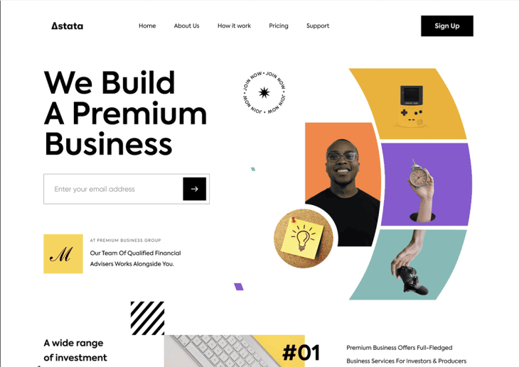
Why Web Page Design Matters More Than Ever
In today’s digital-first world, your website is often the first impression of your business. Studies show that users take less than 3 seconds to decide whether to stay or leave a site. A professional Web Page Design is not just about aesthetics—it’s about building trust, delivering value, and guiding visitors toward meaningful actions.
Yet, many websites still fall victim to common design mistakes that frustrate users, damage credibility, and drive potential customers away. The good news? These mistakes are avoidable.
In this comprehensive guide, we’ll cover the 7 most common web page design mistakes, why they hurt your website, and actionable steps to fix them. By the end, you’ll have a clear roadmap to create a site that not only looks great but also performs exceptionally well.
See More: Best Website Builders Compared: Which One Fits Your Business?
7 Common Web Page Design Mistakes That Drive Visitors Away
Mistake 1: Cluttered and Overloaded Layouts
Why It’s a Problem
One of the most common issues in Web Page Design is trying to fit too much information, too many visuals, or too many interactive elements onto a single page. While the intention might be to impress visitors, the result is usually the opposite: confusion and frustration.
When users land on a cluttered page, they struggle to identify what’s important. Their eyes dart from banners to pop-ups, oversized buttons, and competing headlines. Instead of being guided toward the action you want them to take, they feel overwhelmed and click away.
Research shows that users form an impression of your site in less than 0.05 seconds. If your layout is disorganized, you risk losing them before they even start exploring.
Signs Your Page Is Cluttered
You can often identify a cluttered design by looking for these red flags:
- Too many font styles – Using more than 2–3 different fonts creates a chaotic look and makes content harder to read.
- Competing calls-to-action (CTAs) – If every button shouts “Buy Now,” “Sign Up,” “Contact Us,” and “Learn More” at the same time, users won’t know which one matters most.
- Overloaded sidebars – Widgets, banners, and irrelevant links distract visitors from your core content.
- Lack of visual hierarchy – Headlines, images, and text blocks blend together with no clear order of importance.
If your visitors can’t instantly tell what the page is about or what step to take next, your design is working against you.
How to Fix It
The best Web Page Design communicates clarity. Here’s how to clean up a cluttered layout:
- Embrace white space – Give elements breathing room so users can focus on the most important parts of the page. White space isn’t “wasted space”—it’s a design tool that improves readability and flow.
- Focus on one main CTA – Every page should have a primary purpose, whether it’s to capture leads, encourage a purchase, or drive inquiries. Place one strong CTA above the fold and repeat it strategically as users scroll.
- Limit font styles and colors – Use a consistent design system with no more than 2–3 font styles and a limited color palette aligned with your brand identity.
- Apply grid-based design principles – Organize elements in a grid to create balance, order, and visual hierarchy. This helps guide users naturally from one section to the next.
- Prioritize mobile layouts – Clutter is even worse on smaller screens. Ensure your mobile Web Page Design highlights only essential elements.
SEO Value
A clean and well-structured design isn’t just better for users—it’s also better for search engines. Here’s why:
- Improved dwell time – Visitors are more likely to stay and explore when the layout feels organized and user-friendly.
- Reduced bounce rate – Clear navigation and uncluttered layouts encourage users to click deeper into your site.
- Better crawlability – A logical, structured page makes it easier for search engines to understand your content hierarchy.
- Positive UX signals – Google measures user experience indirectly through engagement metrics. A streamlined Web Page Design sends strong signals that your site satisfies user intent.
See More: Custom UI UX Design Solutions for Businesses in 2025
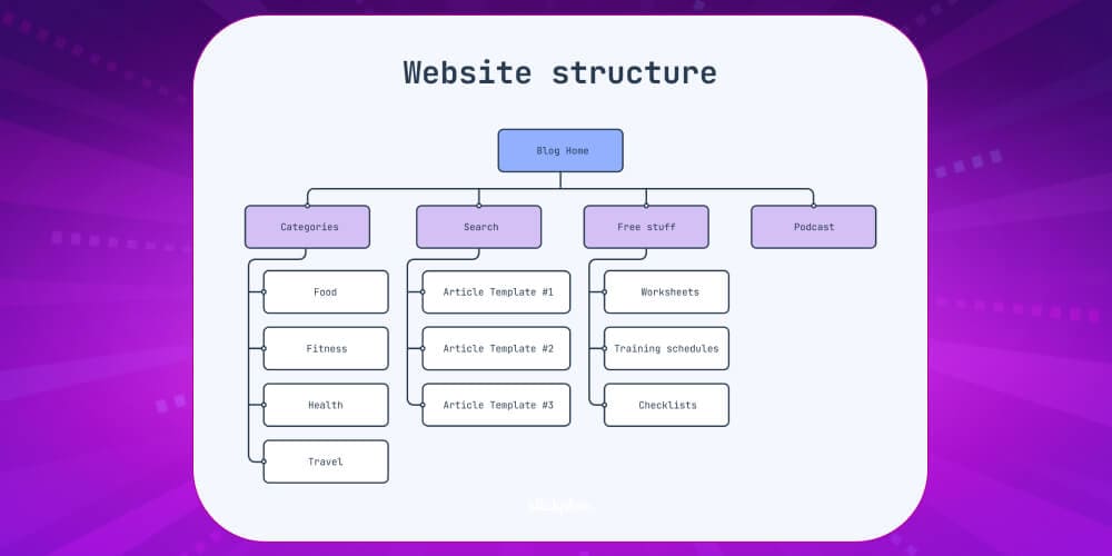
Mistake 2: Poor Navigation and Menu Structure
Why It’s a Problem
Navigation is the backbone of any effective Web Page Design. If visitors can’t find what they’re looking for quickly, they’ll get frustrated and leave—often within the first 10 seconds. A poorly designed menu or confusing navigation structure not only drives away potential customers but also signals to search engines that your website may not provide a good user experience.
Your website’s navigation should act like a map that guides visitors effortlessly to their destination. When this isn’t the case, users bounce, conversions drop, and your business misses valuable opportunities.
Signs of Bad Navigation
Here are common red flags that suggest your navigation needs an overhaul:
- Hidden or unclear menus – If important menu items are tucked away in drop-downs, hamburger icons, or hidden layers, users may never find them.
- Overly complex menus – Navigation bars with 10+ items overwhelm visitors and make decision-making harder.
- No breadcrumb trails – Without breadcrumbs, users don’t know where they are on your site or how to backtrack.
- Inconsistent structure – If navigation looks different on every page, it creates confusion and disrupts the browsing flow.
- Lack of prioritization – Treating all pages as equally important dilutes focus. Visitors need a clear path to your most valuable pages (e.g., services, products, or contact).
How to Fix It
Improving navigation isn’t about adding more links—it’s about creating clarity and simplicity. Here’s how to fix poor menu structure:
- Design a clear, top-level navigation bar – Place your most important pages (Home, Services, About, Contact, Blog) in the primary menu.
- Organize logically with categories – Break down services or products into clear categories and subcategories so users can drill down intuitively.
- Add a search bar – A search function gives visitors direct control, helping them find exactly what they need without endless clicks.
- Use breadcrumb trails – Breadcrumbs show users their location within the site structure, reducing frustration and encouraging deeper exploration.
- Ensure consistency across devices – Menus should be user-friendly on desktop, tablet, and mobile. Responsive design ensures your navigation adapts smoothly.
- Limit menu depth – Ideally, users should reach any page within 3 clicks. Beyond that, you risk losing them.
SEO Value
Navigation impacts not only user experience but also search engine optimization:
- Improved crawlability – Search engine bots rely on navigation to discover and index content. A clear menu ensures your most valuable pages get indexed.
- Keyword optimization – Properly labeled menu items (e.g., “Web Page Design Services” instead of “Our Work”) help target important keywords.
- Internal linking power – Strong navigation distributes “link juice” across your site, boosting the authority of key pages.
- Lower bounce rates – When users find what they need quickly, they stay longer, signaling to Google that your site satisfies intent.
A user-friendly and SEO-optimized navigation system can transform a confusing site into one that feels natural, professional, and trustworthy.
See More: How Custom Web Development Services Can Skyrocket Your Sales
Mistake 3: Ignoring Mobile Responsiveness
Why It’s a Problem
In 2025, more than 65% of global website traffic comes from mobile devices, and the percentage continues to grow each year. This means the majority of your audience is likely viewing your site on a smartphone or tablet. If your Web Page Design does not automatically adjust to different screen sizes, visitors will immediately struggle—and most won’t give your site a second chance.
Non-responsive websites frustrate users with tiny text, awkward layouts, and buttons that are almost impossible to tap. Research shows that 57% of users will not recommend a business with a poorly designed mobile site. Worse, mobile-unfriendly pages send negative signals to search engines, hurting your rankings and visibility.
Signs of Poor Mobile Design
You may be losing visitors to competitors if your website shows these mobile design issues:
- Tiny text requiring zooming – Users shouldn’t have to pinch and zoom just to read a paragraph.
- Buttons placed too closely – Overlapping or tiny buttons make it hard for users to tap the right option with their fingers.
- Cut-off or distorted images – Images that don’t scale properly ruin the design and disrupt content flow.
- Horizontal scrolling – Forcing users to scroll sideways instead of vertically is a clear sign of bad Web Page Design.
- Slow mobile loading speed – Large desktop-sized elements on mobile often increase load times and cause abandonment.
How to Fix It
Creating a mobile-responsive site requires designing with mobile users in mind first—not treating them as an afterthought. Here’s how to do it right:
- Adopt responsive design frameworks – Use tools like Bootstrap, Tailwind CSS, or Foundation to ensure layouts adapt automatically to screen size.
- Test across multiple devices – Don’t just preview on your laptop. Test your website on real iOS, Android, and tablet devices to catch issues.
- Design for touch interaction – Mobile users rely on taps and swipes, not clicks. Make buttons large, spaced out, and thumb-friendly.
- Prioritize mobile-first design – Start by designing for the smallest screen, then expand upward for tablets and desktops. This ensures essentials are never lost.
- Optimize mobile images and videos – Use responsive image formats (like WebP) and ensure video players scale correctly without breaking layouts.
- Simplify forms – Long, complex forms frustrate mobile users. Use autofill, dropdowns, and fewer fields for smoother interactions.
SEO Value
Google has fully rolled out mobile-first indexing, meaning it primarily evaluates the mobile version of your site when determining rankings. A mobile-unfriendly site is treated as low quality, no matter how great your desktop design looks.
- Higher rankings – Mobile responsiveness is a direct ranking factor.
- Better user metrics – Responsive design reduces bounce rate and increases time-on-site.
- Improved accessibility – A well-structured mobile layout helps both users and search engines understand your content.
- Local SEO advantage – Since most local searches are done on mobile, responsive Web Page Design is essential for local businesses to appear in Google Maps and “near me” searches.
See More: Professional Custom Web Development Services for Businesses in 2025
Mistake 4: Slow Loading Speed

Why It’s a Problem
Website visitors today have zero patience for slow-loading pages. Research shows that 53% of users abandon a site if it takes longer than 3 seconds to load, and even a 1-second delay can lower conversions by 7%. In the age of instant digital gratification, speed is not just a technical detail—it’s a fundamental part of user experience.
A sluggish site damages credibility, frustrates users, and drives potential customers directly into the arms of faster competitors. More importantly, search engines like Google consider speed a direct ranking factor. That means no matter how beautiful your Web Page Design looks, if it’s slow, it won’t perform well in search results.
Common Causes of Slow Pages
Here are some of the most frequent culprits behind slow-loading sites:
- Unoptimized images – Large image files take too long to load, especially on mobile networks.
- Excessive plugins or scripts – Too many third-party add-ons (like pop-ups, analytics tools, or chat widgets) increase load time.
- Cheap hosting servers – Shared or low-quality hosting providers often can’t handle traffic spikes, slowing performance.
- No caching – Without browser or server caching, your site reloads every single element each time a visitor returns.
- Lack of a Content Delivery Network (CDN) – If you serve content from only one server location, users far away experience delays.
- Heavy code and bloated design – Poorly written CSS, JavaScript, or unused code clutters your site and drags performance down.
How to Fix It
Fortunately, most speed problems can be solved with the right optimization strategies:
- Compress and optimize images – Use tools like TinyPNG, ImageOptim, or WebP format to reduce image sizes without losing quality.
- Minify CSS, JavaScript, and HTML – Remove unnecessary spaces, characters, and comments to streamline code.
- Enable lazy loading – Load images and videos only when users scroll to them, reducing the initial load time.
- Use caching techniques – Browser caching stores site data locally, so returning visitors don’t have to reload everything.
- Upgrade your hosting – Invest in a reliable hosting provider with fast response times, or consider cloud hosting for scalability.
- Implement a CDN – Distribute your content across multiple global servers to deliver pages faster, no matter where users are located.
- Audit plugins and scripts – Remove unnecessary add-ons and only keep the essentials.
- Use speed testing tools – Platforms like Google PageSpeed Insights, GTmetrix, and Pingdom provide actionable reports on what’s slowing your site down.
SEO Value
Website speed directly impacts both user behavior and search engine rankings:
- Better rankings – Google’s Core Web Vitals specifically measure page load times, responsiveness, and visual stability. Faster pages rank higher.
- Improved conversions – A fast-loading Web Page Design creates smoother shopping, signup, or inquiry experiences.
- Lower bounce rates – Users stay longer when they don’t have to wait, signaling to search engines that your site provides value.
- Mobile advantage – Since mobile networks are often slower, optimizing speed is even more critical for mobile-first indexing.
See More: How Much Does Web Page Design Cost in Singapore?
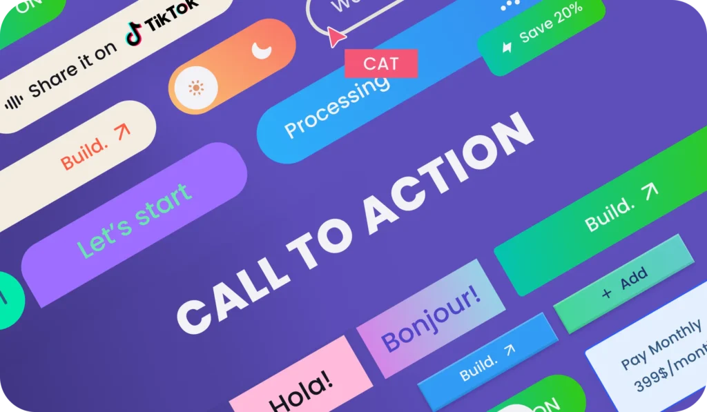
Mistake 5: Weak or Unclear Calls-to-Action (CTAs)
Why It’s a Problem
A Call-to-Action (CTA) is one of the most critical elements of effective Web Page Design. It tells your visitors what to do next—whether that’s signing up for a newsletter, requesting a quote, or making a purchase. Without strong CTAs, your website becomes little more than an online brochure with no direction.
The problem with weak or hidden CTAs is simple: users don’t know what step to take. Generic text like “Click Here” or “Learn More” doesn’t communicate value, while poorly placed CTAs often go unnoticed. The result? Missed leads, lower engagement, and fewer conversions.
Studies show that a well-placed, well-written CTA can increase conversion rates by up to 202%, while unclear CTAs cause users to leave without taking meaningful action.
Signs of Weak CTAs
You may be losing conversions if your CTAs show these symptoms:
- Generic or vague button text – Words like “Submit” or “Click Here” don’t tell users what benefit they’ll get.
- Buried below the fold – If your main CTA is hidden at the very bottom of the page, many visitors won’t see it.
- Multiple CTAs competing for attention – Too many conflicting actions confuse visitors, causing decision paralysis.
- No urgency or value proposition – CTAs that fail to highlight “why now” or “why here” lack persuasive power.
- Poor design contrast – Buttons that blend into the background instead of standing out reduce click-through rates.
How to Fix It
A strong CTA is clear, visible, and action-oriented. Here’s how to improve them:
- Use action-driven language – Replace vague words with benefit-focused verbs, e.g., “Get Your Free Quote,” “Start My Trial,” or “Download the Free Guide.”
- Place CTAs strategically – Position your main CTA above the fold (visible without scrolling), and repeat it throughout the page where it makes sense.
- Highlight with contrasting colors – Make buttons stand out visually without clashing with your overall Web Page Design.
- Communicate value – Tell users what they’ll gain, e.g., “Save 20% Today” or “Join 5,000+ Happy Customers.”
- Create urgency – Add time-limited offers or scarcity signals such as “Limited Seats Available” or “Offer Ends Soon.”
- Optimize for mobile – Ensure CTAs are large enough to tap easily on smaller screens.
SEO Value
While CTAs don’t directly influence search rankings, they have a major indirect impact:
- Improved engagement signals – Strong CTAs encourage users to click deeper, boosting session duration and page views per session.
- Lower bounce rates – When visitors take action, they’re less likely to leave after just one page.
- Content alignment – Well-written CTAs that align with page intent reinforce relevance, a factor Google uses in ranking.
- Conversion-focused design – A high-performing Web Page Design with clear CTAs signals to search engines that your site delivers value to users.
In essence, your CTA is the bridge between attention and action. Without it, even the best design and content won’t translate into results.
See More: Fast & Affordable Website Creation Singapore Services in 2025
Mistake 6: Inconsistent Branding and Visual Design
Why It’s a Problem
A disjointed web page design with random colors, mismatched fonts, or inconsistent messaging creates confusion and damages credibility. Visitors form an impression of your brand within seconds, and if your website feels unprofessional or off-brand, they are less likely to engage, convert, or return. Inconsistency across design elements undermines trust and makes your business appear unreliable.
Signs of Inconsistency
- Different versions of your logo used across multiple pages or sections.
- Colors that do not align with your official brand identity.
- Stock images that feel generic or irrelevant to your actual business.
- Shifts in tone of voice between blog posts, landing pages, and service pages.
- Inconsistent button styles or typography that disrupt user flow.
How to Fix It
- Develop a brand style guide: Define and document your official brand colors, typography, logo usage, imagery style, and tone of voice. Share it with anyone who contributes to your website.
- Ensure logo consistency: Use a single, high-quality version of your logo that scales well across desktop and mobile.
- Stick to brand-aligned colors and fonts: Limit design to a cohesive palette of 2–3 primary colors and 2 font styles that reflect your identity.
- Replace stock photos with authentic visuals: Showcase original photography of your team, office, or products to build credibility.
- Keep tone uniform: Whether your content is formal, friendly, or conversational, maintain the same voice across all pages to strengthen brand personality.
- Standardize layouts and CTAs: Buttons, headers, and page structures should follow the same design rules across your site.
SEO Value
Consistency enhances user trust and encourages longer engagement, which boosts behavioral metrics like time on page and repeat visits. A recognizable, professional-looking website is also more likely to earn backlinks and social shares, which directly and indirectly improve SEO rankings. Google favors sites that deliver not only technical quality but also user trustworthiness — making brand consistency a key factor in a strong Web Page Design.
See More: E-Commerce Website Design: Boost Sales with Stunning UX and Effective Strategies
Mistake 7: Neglecting Accessibility and User Experience
Why It’s a Problem
Accessibility is no longer optional—it’s a legal, ethical, and business necessity. Websites that ignore accessibility standards exclude people with disabilities, which can result in lawsuits, compliance issues, and lost opportunities. Beyond legal risks, poor accessibility frustrates users, reduces conversions, and damages your brand reputation. In 2025, inclusivity is not just good practice—it’s a competitive advantage.
Signs of Poor Accessibility
- Images lack alt text, leaving screen reader users without context.
- Text and background colors have low contrast, making content hard to read.
- Videos are missing captions or transcripts, excluding hearing-impaired users.
- The site cannot be navigated with a keyboard alone, blocking users with mobility challenges.
- Interactive elements (forms, buttons, menus) lack proper ARIA labels or cues.
How to Fix It
- Add descriptive alt attributes to all images so screen readers can convey meaning.
- Ensure color contrast meets WCAG 2.1 AA standards for readability.
- Provide closed captions and transcripts for all audio and video content.
- Enable keyboard navigation by testing forms, menus, and interactive elements without a mouse.
- Use semantic HTML (headings, lists, landmarks) to give structure to assistive technologies.
- Test with accessibility tools like WAVE, axe, or Lighthouse to identify gaps.
- Follow WCAG guidelines to make your design inclusive from the ground up.
SEO Value
Google rewards websites that prioritize accessibility because they improve overall usability. Accessible sites tend to have cleaner code, better structure, and higher engagement—all positive ranking signals. Alt text and semantic HTML also help search engines understand your content better, boosting visibility in image search and featured snippets. Ultimately, an accessible Web Page Design creates a smoother user experience for everyone, leading to stronger SEO performance and higher conversions.
See More: Affordable Web Design Services | Professional Websites That Convert
Bonus Mistakes to Avoid in Web Page Design
1, Auto-Playing Audio or Video
Why It’s a Problem
Few things drive visitors away faster than unexpected sounds or videos playing automatically. This not only startles users but also consumes bandwidth, slows page loading, and creates accessibility issues. On mobile devices, auto-play can eat into data plans, frustrating users even more.
How to Fix It
- Disable auto-play for all media files.
- Give users clear play/pause controls.
- Use muted previews or short GIFs to draw attention instead.
- Ensure videos are optimized and optional.
SEO Value
A smoother browsing experience reduces bounce rates. Search engines recognize positive engagement signals and reward sites that prioritize user-friendly media.
2, Pop-Up Overload
Why It’s a Problem
Pop-ups can be effective for collecting leads, but too many at once (newsletter sign-ups, chatbots, promotions) overwhelm visitors. Google also penalizes intrusive interstitials on mobile, reducing visibility in search rankings.
How to Fix It
- Limit pop-ups to one or two well-timed interactions.
- Use exit-intent pop-ups instead of immediate interruptions.
- Ensure pop-ups are easy to close on all devices.
- Provide value in exchange for sign-ups (discounts, guides, free tools).
SEO Value
User-friendly pop-ups keep visitors engaged longer, improving session duration and reducing pogo-sticking (quick back-and-forth between search results).
3, Thin or Low-Quality Content
Why It’s a Problem
Pages with minimal or irrelevant content add little value for users. In 2025, Google’s algorithms focus heavily on E-E-A-T (Experience, Expertise, Authoritativeness, Trustworthiness). Thin content signals poor quality, leading to low rankings.
How to Fix It
- Write in-depth, valuable content that answers user intent.
- Use structured formatting (headings, bullet points, FAQs) for readability.
- Add visuals (infographics, videos, case studies) to enrich content.
- Regularly update outdated pages with fresh insights.
SEO Value
High-quality content improves keyword relevance, boosts backlinks, and increases dwell time—key ranking factors for long-term success.
4, Broken Links and Errors
Why It’s a Problem
Broken links frustrate users, waste crawl budget, and damage your site’s credibility. A user who lands on a 404 page is far more likely to abandon your site.
How to Fix It
- Use tools like Screaming Frog or Google Search Console to detect broken links.
- Regularly check and update external references.
- Set up 301 redirects for removed or updated pages.
- Create a helpful custom 404 page with links back to main sections.
SEO Value
Fixing broken links improves crawlability, preserves link equity, and signals professionalism, all of which positively impact rankings.
5, Ignoring Analytics and User Data
Why It’s a Problem
Without analytics, you’re designing in the dark. Many businesses fail to monitor how users interact with their site, missing opportunities to improve conversion rates and fix design flaws.
How to Fix It
- Install Google Analytics 4 and link it with Google Search Console.
- Track important KPIs (bounce rate, session duration, conversions, exit pages).
- Use heatmaps and session recordings (e.g., Hotjar, Crazy Egg) to study behavior.
- Run A/B tests to optimize CTAs, layouts, and forms.
SEO Value
Data-driven improvements lead to higher engagement and conversions. Google favors websites with strong user metrics because they indicate relevance and quality.
See More: Best Web Design Agency In Singapore 2025 – Top Picks & Guide
How to Create a Winning Web Page Design
Creating an effective web page is more than just making it look attractive—it’s about delivering value, guiding users, and achieving business goals. Here’s a comprehensive guide:
1, Focus on User Intent
Understanding why visitors come to your site is crucial. Every visitor has a purpose: some are seeking information, others want to purchase, and some may just be browsing. To address this:
- Conduct user research and create buyer personas to understand your target audience.
- Map out the user journey—from first landing to conversion.
- Tailor content and layout to answer users’ questions quickly.
Tip: Use analytics tools like Google Analytics or Hotjar to track visitor behavior and refine your pages accordingly.
2, Keep It Simple and Purpose-Driven
Cluttered pages confuse users and reduce engagement. Each page should have a single clear purpose:
- Use minimalist design principles—remove unnecessary elements.
- Highlight the most important information using visual hierarchy: headings, subheadings, bullet points, and whitespace.
- Ensure that navigation is intuitive—users should find what they need in 3 clicks or less.
Tip: Every page should answer the question: “What should the user do here?”
3, Optimize for Conversions
A beautiful design is meaningless if it doesn’t convert visitors into leads or customers. Strategies include:
- Clear and visible Call-to-Actions (CTAs)—buttons, forms, or links that prompt immediate action.
- Strategic placement of CTAs above the fold and at the end of content sections.
- Using social proof like testimonials, reviews, or case studies to build trust.
- Providing value propositions—tell users why your offer is better than competitors.
Tip: Use persuasive copywriting techniques like urgency, scarcity, or benefit-driven language to increase conversions.
4, Test, Analyze, and Refine
Even the best designs need iteration. Continuous improvement ensures your web page performs optimally:
- Conduct A/B testing on headlines, CTAs, layouts, and images.
- Monitor key performance indicators (KPIs): bounce rate, time on page, conversion rate.
- Gather user feedback through surveys or usability testing.
- Make adjustments based on data, not assumptions.
Tip: Small changes, like tweaking a button color or headline, can have a surprisingly big impact on results.
5, Invest in Professional Design
While DIY tools are tempting, professional designers bring expertise, experience, and strategy:
- Ensure a balance between aesthetics and functionality.
- Create a consistent brand identity across pages.
- Optimize for mobile responsiveness, speed, and SEO, which are essential for Google ranking and user satisfaction.
- Avoid common pitfalls like poor color contrast, slow-loading images, or confusing layouts.
Tip: Hiring a professional is an investment that pays off in improved user experience, higher conversions, and stronger brand credibility.
6, Additional Elements for Winning Web Page Design
To truly stand out, consider adding:
- Interactive elements: sliders, quizzes, or calculators to engage users.
- Rich media: high-quality images, videos, and infographics to make content digestible.
- Accessibility features: ensure the page is usable for all users, including those with disabilities.
- SEO optimization: properly structured headings, meta descriptions, and fast-loading pages to rank better in search engines.
Build a Website That Attracts and Converts
Your website is more than a digital business card—it’s a 24/7 sales and branding tool. By avoiding these 7 common web page design mistakes, you’ll deliver a seamless, engaging, and professional experience that keeps visitors coming back.
A well-executed Web Page Design improves user satisfaction, boosts search engine rankings, and drives measurable business results.
About iCreationsLAB
At iCreationsLAB, we understand the importance of powerful web design. Since 2008, we have been helping businesses in Singapore and beyond craft websites that not only look beautiful but also perform exceptionally well.
We are a Singapore web design company specialising in:
- Website Design and Development
- E-Commerce Solutions
- Mobile Web Design
- CMS Integration
- Custom Web Applications
- Social Media Marketing
- Email & SMS Marketing
- Online Marketing Strategies
Whether you’re building a new site or redesigning an existing one, our expert team ensures your digital presence is future-proof, conversion-focused, and SEO-ready.
Contact iCreationsLAB today to transform your website into a business growth engine.