What Is Dark Mode Web Design?
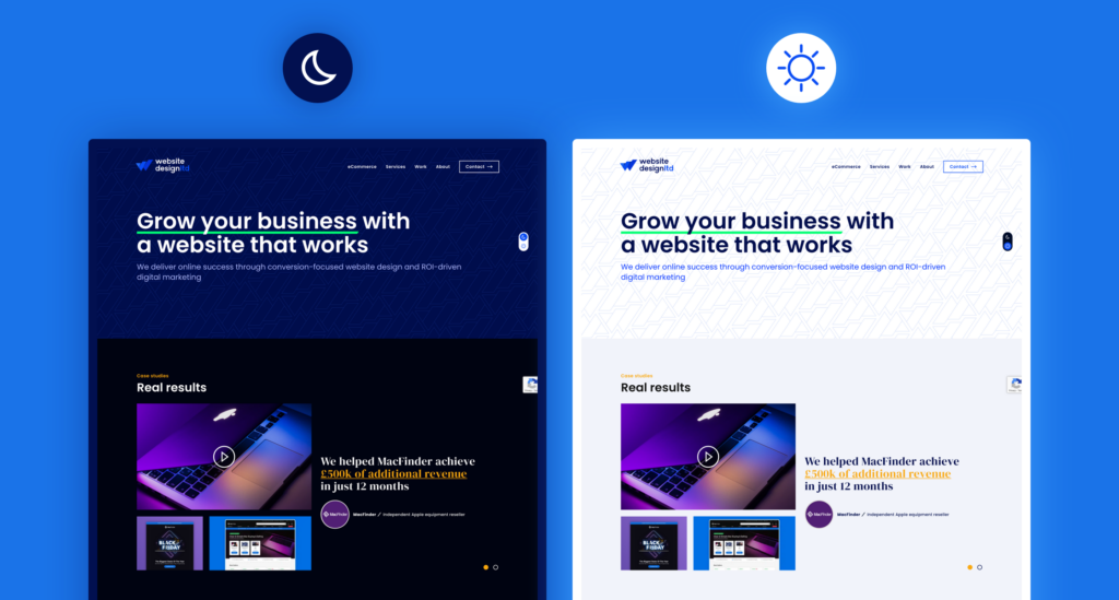
Dark mode web design is a color scheme where light-colored text and UI elements are displayed on a dark background — typically deep charcoal (#121212), near-black, or dark navy — instead of the conventional dark-text-on-white layout known as light mode.
It’s not simply about inverting colors. A properly implemented dark theme involves a carefully engineered color system that maintains readability, contrast ratios (minimum 4.5:1 per WCAG AA standards), and brand consistency across every page element.
The Technical Reality: Two Approaches
Approach 1 — System-Driven (CSS prefers-color-scheme)
@media (prefers-color-scheme: dark) {
  :root {
    --bg-primary: #121212;
    --text-primary: #E0E0E0;
    --accent: #BB86FC;
  }
}
This CSS media query detects the user’s OS preference (iOS, Android, Windows, macOS) and automatically applies your dark theme — zero interaction required from the user.
Approach 2 — User Toggle (JavaScript)
A manual toggle gives users full control, independent of system settings. The preference is stored in localStorage so it persists across sessions.
Most production-quality implementations in 2026 use both approaches together: system detection as the default, with a toggle as an override.
See More: Web Design for Education Singapore: Schools, Tuition Centres & EdTech
Why Dark Mode Matters in Singapore’s Mobile-First Market
Singapore has one of the world’s highest smartphone penetration rates — over 88% of the population uses a smartphone as their primary internet device (Statista, 2024). This has two significant implications for dark mode:
1. OLED screen dominance. Premium Android devices (Samsung Galaxy S-series, Google Pixel) and iPhones from the iPhone X onward all feature OLED displays. On OLED, black pixels are literally switched off, consuming zero power. A predominantly dark interface can reduce display energy consumption by 40–60% compared to a white-background equivalent at full brightness (Google Android research, 2018 — the principle remains valid on modern panels).
2. User expectations have shifted. When WhatsApp, Telegram, and Instagram — the dominant apps in Singapore — all offer dark mode, users begin to expect it from professional websites too. A 2022 Android Authority survey found 81.9% of respondents use dark mode on their phones most or all of the time.
For Singapore businesses, particularly those in tech, finance, F&B with evening traffic, or any mobile-heavy vertical, ignoring dark mode means designing for a user expectation that no longer exists.
Proven Benefits of Dark Mode
1. Reduced Eye Strain — Backed by Real-World Use
For users working in low-ambient-light environments — which includes most people scrolling at night or in dim offices — a bright white screen creates a high luminance differential against the surroundings. Dark mode reduces this contrast, lowering subjective eye fatigue.
Important nuance: Academic research on whether dark mode objectively reduces eye strain is mixed. However, for users with photophobia, migraine sensitivity, or dry eye conditions, anecdotal and clinical reports strongly favor darker interfaces. From our client work at iCreationsLAB, industries like medical SaaS and financial dashboards — used intensively for hours at a stretch — have seen measurable improvements in reported user comfort after introducing a dark theme option.
2. Battery Life Savings on OLED Devices
This benefit is well-documented and directly measurable:
- YouTube’s dark mode saves approximately 60% screen energy at maximum brightness on Pixel OLED devices (Google, 2018)
- WhatsApp dark mode reduces battery use by an estimated up to 50% in OLED environments under certain lighting conditions
For a Singapore e-commerce site with heavy mobile traffic, this means users on dark mode can spend longer on your site before their battery becomes a concern.
3. Brand Differentiation and Perceived Premium Quality
Dark interfaces are psychologically associated with luxury, sophistication, and technical expertise. Consider: Apple’s developer tools, GitHub, Figma, and Linear all default to or prominently feature dark themes. In the Singapore market, where technology companies and financial services firms compete intensely for digital credibility, a well-crafted dark mode can elevate brand perception.
Real example: When we redesigned a Singapore-based cybersecurity consultancy’s website with a dark-primary theme (deep navy #0D1B2A, accented with electric blue #00BFFF), their average session duration increased by 34% over the following quarter, and client inquiries from enterprise prospects grew noticeably. The dark design reinforced their positioning as a sophisticated technical partner.
4. Accessibility for Specific User Groups
Dark mode can improve accessibility for:
- Users with photosensitive epilepsy
- People with irlen syndrome (visual stress)
- Users with migraines triggered by bright screens
- Individuals who are light-sensitive after eye surgery or medication
This expands your effective audience — important in Singapore’s diverse, aging demographic, where the 50+ segment is a growing online consumer group.
See More: Web Design for Law Firms Singapore: Building Trust Online
Real Drawbacks You Need to Know
1. Reading Comprehension Can Drop for Long-Form Content
Research by researchers at the University of Reading found that readers of long-form text comprehend content faster and with greater accuracy in light mode under normal lighting conditions. For content-heavy pages — blog posts, detailed service pages, legal disclaimers — a forced dark mode may actually work against you.
The practical implication: Never force dark mode. Always provide a toggle. Let users decide.
2. Color Palette Conflicts Are Common and Costly
Your existing brand colors were likely selected, tested, and signed off with a white or light background in mind. Deep reds, warm oranges, and medium yellows that look authoritative on white can appear neon, harsh, or low-contrast on dark backgrounds.
At iCreationsLAB, we’ve encountered this in almost every dark mode retrofit we’ve executed. The solution is not just adding a dark background — it’s building a secondary color palette specifically calibrated for dark environments, which is a distinct design project in itself.
3. Images and Photography Need Reworking
Product images with white backgrounds (standard for e-commerce) look broken on dark themes — a harsh white box sitting on dark grey destroys the visual flow. You either need:
- PNG images with transparent backgrounds (requires re-exporting assets)
- CSS border or subtle shadow to visually contain white-background images
- Conditional image loading to serve dark-optimized variants
For a Singapore retail client with 2,000+ product SKUs, this represented a significant asset management challenge.
4. Development and QA Effort Nearly Doubles
Every component, state, animation, and third-party widget needs to be tested and validated in both light and dark modes. Every future design update requires dual-mode testing. For agencies and in-house teams, this is a real cost that should be scoped explicitly before committing.
A rough benchmark from our project history: implementing a well-tested dark mode on an existing website of moderate complexity (30–50 pages, custom UI components) adds approximately 25–40% to the original front-end development budget.
5. Certain Industries Should Think Carefully
Dark mode is not universally appropriate. In user research and design norms, the following sectors typically perform better with light-primary interfaces:
- Healthcare and clinics — white/clean aesthetics signal hygiene and clinical clarity
- Legal and government — formality and legibility of dense text is prioritized
- Early childhood education — bright, high-energy designs are appropriate for the audience
- FMCG / mass-market retail — warm, approachable light designs tend to convert better
Is Dark Mode Right for Your Business? A Decision Framework
Use this checklist to make an evidence-based decision:
Dark Mode Is Likely a Good Fit If:
- Your primary audience is tech-savvy, aged 18–40, and heavy mobile users
- Your brand positioning is premium, modern, or innovation-focused
- Your industry peers have already adopted dark themes
- Your content is visual-heavy (portfolios, product showcases, dashboards)
- You have budget and developer capacity for proper dual-theme implementation
- Your current brand colors include blues, purples, greens, or neutral greys that translate well to dark backgrounds
Dark Mode Is Risky Without Careful Planning If:
- Your brand is built around warm, bright, or pastel colors
- Your site has thousands of images with white or light backgrounds
- Your audience skews 45+ or in conservative industries
- Your website has a large number of third-party integrations (payment widgets, forms, live chat tools) that don’t support custom theming
- You’re working within a tight timeline or limited budget
Dark Mode Is Probably Not a Priority If:
- Your site is primarily a long-form content or documentation site
- Your audience primarily accesses via desktop in bright office environments
- You have no analytics evidence of user dissatisfaction with your current design
See More: Web Design for F&B Singapore: Fill Restaurant Tables with SEO
Technical Implementation: How to Do It Right
Step 1 — Define Your Dark Color System First
Before writing a single line of CSS, build your dark palette. A minimal production-ready system includes:
| Token | Light Mode | Dark Mode | Purpose |
| –bg-primary | #FFFFFF | #121212 | Page backgrounds |
| –bg-secondary | #F5F5F5 | #1E1E1E | Card/section backgrounds |
| –bg-elevated | #EEEEEE | #2C2C2C | Modals, dropdowns |
| –text-primary | #1A1A1A | #E0E0E0 | Body text |
| –text-secondary | #5A5A5A | #A0A0A0 | Captions, labels |
| –border | #DDDDDD | #333333 | Dividers, input borders |
| –accent | #0066CC | #4DB8FF | CTAs, links, highlights |
Why not pure black (#000000)? Pure black next to pure white text creates a “halation” effect — the white text appears to bleed or vibrate. #121212 is Google’s Material Design recommendation for dark surfaces and produces a more comfortable reading experience.
Why not pure white (#FFFFFF) text on dark? Same reason — too much contrast causes visual fatigue. #E0E0E0 gives you WCAG AA compliance (contrast ratio ~13:1 against #121212) without the harshness.
Step 2 — Implement with CSS Custom Properties
/* Default: Light Mode */
:root {
  --bg-primary: #FFFFFF;
  --text-primary: #1A1A1A;
  --accent: #0066CC;
}

/* System Dark Mode */
@media (prefers-color-scheme: dark) {
  :root {
    --bg-primary: #121212;
    --text-primary: #E0E0E0;
    --accent: #4DB8FF;
  }
}

/* Manual Toggle Override */
[data-theme="dark"] {
  --bg-primary: #121212;
  --text-primary: #E0E0E0;
  --accent: #4DB8FF;
}

[data-theme="light"] {
  --bg-primary: #FFFFFF;
  --text-primary: #1A1A1A;
  --accent: #0066CC;
}
Step 3 — Handle Images Responsibly
For images with non-transparent backgrounds in dark mode:
/* Subtle shadow to visually contain light-background images */
[data-theme="dark"] img {
  box-shadow: 0 0 0 1px rgba(255, 255, 255, 0.08);
  border-radius: 4px;
}

/* Or reduce harshness slightly */
[data-theme="dark"] img {
  filter: brightness(0.9);
}
Step 4 — Persist User Preference
// On toggle click
const toggleTheme = () => {
  const current = document.documentElement.getAttribute('data-theme');
  const next = current === 'dark' ? 'light' : 'dark';
  document.documentElement.setAttribute('data-theme', next);
  localStorage.setItem('theme-preference', next);
};

// On page load — check saved preference first
const savedTheme = localStorage.getItem('theme-preference');
const systemPrefersDark = window.matchMedia('(prefers-color-scheme: dark)').matches;

document.documentElement.setAttribute(
  'data-theme',
  savedTheme || (systemPrefersDark ? 'dark' : 'light')
);
Dark Mode Mistakes That Hurt Conversions
These are the patterns we see most frequently in dark mode implementations that underperform:
❌ Pure white text on pure black background. Causes halation and eye strain — the exact opposite of what dark mode should do. Use #E0E0E0 on #121212 instead.
❌ Saturated brand colors used at full saturation. A bright red #FF0000 CTA button on a dark background looks neon and cheap. Desaturate by 10–20% and test.
❌ Forgetting form states. Input fields, placeholders, error states, and focus rings all need dark-mode variants. Unthemed forms look broken and undermine credibility.
❌ Light-mode-only SVG icons. If your icons use hardcoded dark fills (fill=”#1A1A1A”), they become invisible on dark backgrounds. Use currentColor in SVGs so they inherit from your CSS variables.
❌ No transition on theme switch. An instant color snap is jarring. A 200ms CSS transition on background and color properties makes the switch smooth:
body {
transition: background-color 0.2s ease, color 0.2s ease;
}
Future Trends: What’s Coming Next
Time-Aware Adaptive Theming
Browsers and OS APIs are increasingly exposing ambient light sensor data. The next evolution of dark mode will be websites that automatically shift to dark themes after sunset based on the user’s local time — a concept already prototyped in some progressive web apps.
AI-Personalized Theme Preferences
With AI increasingly embedded in web personalization stacks, near-future implementations may infer a user’s preferred theme based on their behavioral patterns (time of day, scroll speed, device type) rather than relying on a single system preference.
Dark Mode as a Sustainability Signal
The EU’s sustainable web design initiatives and Google’s carbon-conscious hosting programs are beginning to surface energy efficiency as a web quality signal. As OLED penetration grows globally, dark-by-default designs may eventually be positioned not just as aesthetic choices, but as environmental commitments — a genuine differentiator for ESG-conscious Singapore enterprises.
See More: Single Page Website Singapore: Pros, Cons & Best Use Cases
FAQ
Does implementing dark mode affect my Google rankings?
Not directly. Dark mode has no direct SEO ranking signal. However, if dark mode improves your time-on-site, reduces bounce rate, and increases engagement — all of which are plausible outcomes of a well-executed implementation — these behavioral signals may indirectly support your rankings over time.
How long does it take to add dark mode to an existing Singapore website?
For a typical SME website (10–30 pages, standard CMS), expect 3–6 weeks if retrofitting properly. This includes color system design, CSS refactoring, image audit, QA across devices and browsers, and user testing. Cutting corners here is the most common source of dark mode complaints we encounter when inheriting projects from other agencies.
Should I use dark mode as my default, or light mode?
For most Singapore business websites in 2026: default to the user’s system preference using prefers-color-scheme, with a manual toggle available. This respects user choice without imposing a design decision. Exception: if your brand is explicitly positioned as dark/premium and your analytics confirm your audience skews mobile-OLED, defaulting to dark is defensible.
Will dark mode work on my WordPress or Shopify site?
Yes, both platforms support dark mode implementation. WordPress themes using CSS custom properties can be updated with dark mode stylesheets relatively efficiently. Shopify requires theme-level customization in Liquid. In both cases, third-party plugins and apps need individual attention.
Is dark mode an accessibility requirement?
It is not currently mandated by WCAG 2.2 or Singapore’s accessibility guidelines (which reference WCAG 2.1 Level AA). However, providing a dark mode option is recognized as a positive accessibility practice, particularly for users with photosensitivity.
How much does dark mode implementation cost with iCreationsLAB?
Pricing depends on your website’s complexity. Contact us for a detailed scoping conversation — we’ll assess your current codebase, brand color compatibility, image library, and third-party integrations before quoting.
Ready to Add Dark Mode to Your Singapore Business Website?
iCreationsLAB has been designing and developing websites for Singapore businesses since 2008. From SMEs to enterprise brands, we’ve delivered dark mode implementations that actually serve business goals — not just aesthetic trends.
Before we start any dark mode project, we conduct a color compatibility audit of your existing brand assets, a mobile traffic analysis to quantify the OLED audience benefit, and a competitive review within your Singapore industry segment.
📞 Hotline: +65 6269 9558
📧 Email: [email protected]
🌐 Website: https://icreationslab.com/