Building a successful website today transcends mere aesthetics and basic functionality. It demands a highly strategic and technical approach where Website Design and Development are intrinsically linked with Search Engine Optimization (SEO) from the very first wireframe. The era of bolt-on SEO after launch is over; modern digital success requires an engineered approach for both search crawlers and human users.
This technical guide outlines 15 advanced steps for integrating SEO into every stage of your website design and development process. By mastering these principles, you will ensure your digital presence is architected for top search rankings, maximized performance, and superior conversion rates.
Phase I: Strategic Design and UX/UI Foundation (Steps 1-5)
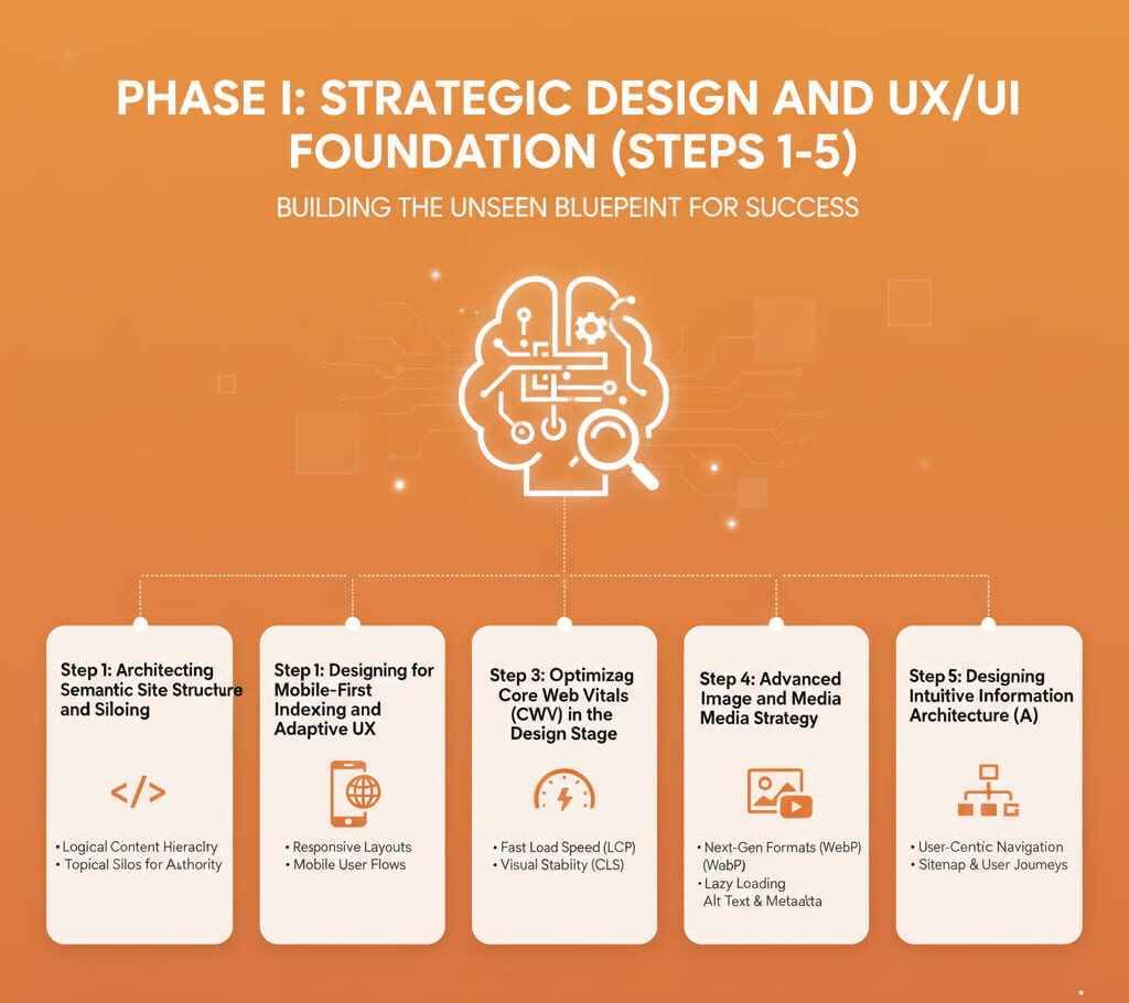
The design phase is where the fundamental rules of SEO are established. Flawed information architecture or a poor user experience (UX) will place an insurmountable barrier to ranking and conversion, regardless of how clean the subsequent code is.
Step 1: Architecting Semantic Site Structure and Siloing
A clear, deep, and organized site structure is the bedrock of technical SEO. It directs link equity (PageRank) and signals topical authority to search engines. Implementing a silo structure is a sophisticated method to achieve this.
Action: Design a site map that strictly enforces content hierarchy. All major pages (Pillars) should be no more than 3-4 clicks from the homepage. Group related subtopics (Clusters) within specific directories (Silos) and restrict internal linking primarily to content within that silo.
Benefit: This structure enhances crawl depth and demonstrates to search engines that your site is a comprehensive authority on specific topics, rather than a collection of disparate pages.
Step 2: Designing for Mobile-First Indexing and Adaptive UX
Google uses the mobile version of your content for indexing and ranking. Your design process must start with the smallest screen. This goes beyond simple responsiveness; it demands an adaptive UX.
Action: Conduct all initial wireframing and prototyping with a mobile-first mindset. Prioritize touch targets, finger-friendly navigation, and compressed content presentation. Use viewport metadata correctly to instruct the browser on scaling. Ensure that critical content and interactive elements are present and easily accessible on the mobile view, as Google will primarily evaluate that version.
Technical Note: Adopt modern CSS techniques like CSS Grid and Flexbox early in the design phase to facilitate complex, yet highly controllable, layout adaptations across breakpoints.
See More: 10 Crucial Elements for High-Converting eCommerce Homepage Design
Step 3: Optimizing Core Web Vitals (CWV) in the Design Stage
Core Web Vitals (CWV)—specifically LCP (Largest Contentful Paint), FID (First Input Delay), and CLS (Cumulative Layout Shift)—are direct ranking signals. Designers must preemptively minimize the causes of poor CWV scores.
- Action for LCP: Design the above-the-fold content to be minimalist. Avoid placing large, unoptimized images or carousels as the primary hero element. Pre-determine asset priority.
- Action for CLS: Avoid injecting content or ads above existing content after the initial load. Designate reserved space for dynamic elements to prevent the layout from jumping.
- Action for FID: Design layouts that minimize reliance on heavy third-party scripts or complex animations that lock up the main thread during initial load, ensuring the page remains interactive quickly.
Step 4: Advanced Image and Media Strategy
Images are essential for UX but are a primary cause of site bloat. Your media strategy must balance visual appeal with performance.
Action: Specify the use of next-gen image formats like WebP or AVIF in the design specs. Implement a strict policy for responsive images using the HTML <picture> element and the srcset attribute to deliver appropriate image resolutions based on the user’s viewport, rather than just scaling down a massive file.
Technical Detail: Reserve the use of raster images (JPEG/PNG) for complex photographs and use Scalable Vector Graphics (SVG) for logos, icons, and non-photographic illustrations.
Step 5: Designing Intuitive Information Architecture (IA)
IA defines the relationship between different content elements. A confusing IA leads to user abandonment (high bounce rate), a strong negative signal to search engines.
Action: Prioritize usability testing on low-fidelity prototypes. Ensure every page has a clear purpose and a direct path to the next logical step (Call-to-Action). The design must use consistent labeling, breadcrumbs, and internal search functionality that is tested against real user expectations, not internal assumptions.
See More: UX or SEO? Why a Professional Website Designer Needs Both
Phase II: Technical Development and Code Excellence (Steps 6-10)

The development phase is where the technical scaffolding of the website is constructed. Clean, fast, and accessible code is non-negotiable for high SEO performance.
Step 6: Implementing Semantic HTML5 and ARIA Attributes
Semantic HTML ensures that search engine crawlers and assistive technologies (screen readers) can properly interpret the structure and meaning of your content.
Action: Utilize correct HTML5 elements (e.g., <header>, <footer>, <nav>, <article>, <section>) instead of generic <div> tags. For dynamic or custom components, incorporate Accessible Rich Internet Applications (ARIA) attributes (e.g., role, aria-label, aria-hidden) to provide context and meaning where standard HTML is insufficient.
Benefit: This improves crawlability, accessibility (WCAG compliance), and the overall quality score of the code.
Step 7: Critical CSS and Deferred Loading for First Contentful Paint (FCP)
The speed at which the first piece of content (FCP) appears is vital for user retention and LCP scoring. Render-blocking CSS is a common bottleneck.
Action: Implement a Critical CSS strategy. Extract the minimal CSS required to render the visible portion of the page (above the fold) and inline it directly into the HTML <head>.
Technical Detail: Load the remaining, larger CSS files asynchronously after the critical path content has rendered. This ensures the browser doesn’t wait for large stylesheets before displaying the core content.
Step 8: JavaScript Budget and Hydration Strategy
Excessive JavaScript (JS) can degrade performance by blocking the main thread, leading to poor FID and TBT (Total Blocking Time) scores.
Action: Establish a strict JavaScript budget (e.g., under 150KB compressed for the main bundle). When using modern frameworks (React, Vue, Angular), implement a strategic hydration process (the act of attaching event listeners to pre-rendered HTML). Avoid over-hydration, where the entire page is made interactive at once, and instead, use techniques like progressive hydration or partial hydration to only activate necessary components.
Step 9: Server-Side Rendering (SSR) or Static Site Generation (SSG) Implementation
Client-Side Rendering (CSR) often leaves search engine crawlers waiting for the JS to execute before seeing the content, leading to indexing issues.
Action: Choose an architecture that pre-renders content:
- SSG (Static Site Generation): Ideal for brochure sites or blogs. Pages are rendered at build time, resulting in lightning-fast load times and excellent security.
- SSR (Server-Side Rendering): Necessary for dynamic content like e-commerce catalogs or user dashboards. The server renders the initial HTML payload for each request, ensuring the content is immediately available to the crawler and user.
Impact: Dramatically improves LCP and crawlability.
Step 10: Robust API and Data Fetching Strategy
For dynamic sites, the efficiency of data fetching directly affects page speed.
Action: Implement GraphQL instead of traditional REST APIs where possible. GraphQL allows the front-end to request only the specific data fields it needs, eliminating under-fetching (multiple round trips) and over-fetching (receiving unnecessary data), thus reducing payload size and improving perceived load speed. Caching at the data layer is also essential.
See More: 7 Critical Website Development Factors for Conversions
Phase III: Advanced Performance and Optimization (Steps 11-15)
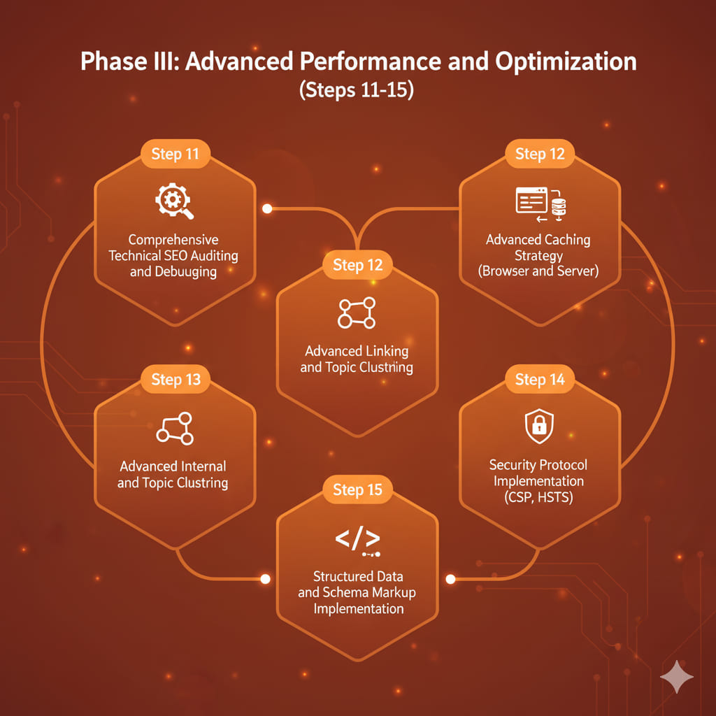
The final phase involves ongoing technical refinement, security, and advanced data communication protocols to maintain ranking advantage.
Step 11: Comprehensive Technical SEO Auditing and Debugging
A launch is just the beginning. Continuous auditing is required to catch decay and errors.
Action: Regularly run comprehensive audits using tools like Google Search Console, Lighthouse, and third-party crawlers (e.g., Screaming Frog). Focus on identifying and resolving crawl budget issues, redirect chains, broken links, and orphaned pages that prevent indexation of high-value content.
Step 12: Advanced Caching Strategy (Browser and Server)
Caching is the single most effective way to improve repeat visit speed and reduce server load.
Action: Implement multi-layered caching:
- Browser Caching: Utilize strong Cache-Control headers (e.g., max-age) to instruct the user’s browser to store static assets locally for extended periods.
- Server/CDN Caching: Configure a robust Content Delivery Network (CDN) and server-level caching (e.g., Varnish, Redis) to serve cached pages instantly from the edge closest to the user.
Step 13: Advanced Internal Linking and Topic Clustering
Beyond basic navigation, sophisticated internal linking is used for strategic SEO.
Action: Ensure anchor text is descriptive and keyword-rich (without being spammy). Use a topic clustering approach where the Pillar page links to all supporting Cluster pages, and all Cluster pages link back to the Pillar page. This reinforces the Pillar’s authority on the central topic.
Step 14: Security Protocol Implementation (CSP, HSTS)
Security is paramount for user trust and is a Google ranking factor.
Action: Beyond the standard HTTPS certificate, implement advanced security headers:
- Content Security Policy (CSP): Mitigates XSS attacks by restricting sources of content the browser is allowed to load.
- HTTP Strict Transport Security (HSTS): Forcibly redirects all connections to HTTPS, preventing insecure fallback connections and protecting against man-in-the-middle attacks.
Step 15: Structured Data and Schema Markup Implementation
Structured data helps search engines understand the meaning of your content, leading to rich snippets (enhanced search results) that dramatically improve Click-Through Rate (CTR).
Action: Implement relevant Schema markup (e.g., Article, Product, Review, FAQPage, LocalBusiness) using the JSON-LD format. Use Google’s Structured Data Testing Tool to validate the implementation and ensure the data is properly nested and error-free.
See More: 5 Best Website Builders for Small Business in 2025
IV. Introducing iCreationsLAB: Engineering Digital Success
At iCreationsLAB, we view website design and development as an engineering discipline centered on achieving measurable business outcomes. We don’t just build beautiful websites; we architect high-performance, SEO-optimized digital platforms designed for maximum conversion and enduring search visibility. Our team of expert designers, technical SEO specialists, and full-stack developers collaborate using the 15 advanced steps outlined in this guide to ensure every project is technically flawless, compliant with Core Web Vitals, and strategically positioned for market dominance. We turn creative vision into tangible, high-ranking assets.
V. 8 FAQs About Website Design and Development
What is the primary difference between website design and development?
Website design focuses on the user-facing elements—the visuals, aesthetics, and user experience (UX/UI). Website development is the technical process of coding and programming the site’s functionality, making the design a dynamic, working application.
Why is SEO integration during the website design and development process so critical?
Integrating SEO from the start ensures the website is technically clean, fast, and structured correctly for search engine crawlers. Attempting to fix fundamental structural or speed issues (like Core Web Vitals) after launch is significantly more complex and costly than building them in correctly from the initial architecture.
What are Core Web Vitals, and which team is primarily responsible for them?
Core Web Vitals (CWV) are a set of metrics measuring real-world user experience for loading speed (LCP), interactivity (FID), and visual stability (CLS). Responsibility is shared: the design team must avoid heavy design choices, and the development team must implement code optimizations (caching, lazy loading, critical CSS) to meet the benchmarks.
Should a business prioritize aesthetic design or technical performance?
A modern, SEO-driven approach requires balancing both. Technical performance (speed/SEO) ensures users can find the site and load it quickly. Aesthetic design (UX/UI) ensures users trust the site, stay engaged, and convert. Sacrificing one for the other results in a website that either can’t be found or won’t convert.
What role does site architecture play in SEO?
Site architecture is crucial as it determines how efficiently search engine bots can crawl and index your content. A logical, shallow, and well-linked structure (like the silo method) ensures that high-priority pages receive appropriate internal link equity, boosting their ranking potential.
What is a “semantic” approach in website development?
A semantic approach means using HTML tags based on their meaning, not just their styling. For example, using the <header> tag for the page header and the <nav> tag for navigation links. This helps crawlers and assistive technology understand the structure and hierarchy of the content more accurately.
What is the main benefit of implementing Structured Data (Schema Markup)?
The main benefit of implementing Schema Markup is to help search engines understand the context of your content, which can lead to your pages being displayed as rich snippets (e.g., star ratings, product prices, FAQ toggles) directly in the search results, significantly increasing your organic Click-Through Rate (CTR).
How does mobile-first design differ from responsive design?
Responsive design means adjusting a desktop layout to fit smaller screens. Mobile-first design means starting the design and development process with the constraints and priorities of the smallest screen (mobile) and then progressively enhancing the layout for larger screens (desktop). This is the approach favored by Google’s indexation process.