In a world increasingly driven by mobile devices, the significance of Responsive Web Design cannot be overstated. It’s the cornerstone of creating websites that provide a seamless user experience across all screen sizes and devices. Whether users are browsing on a smartphone, tablet, desktop, or even a smart TV, a well-executed responsive design ensures that your website adapts fluidly, maintaining both functionality and aesthetic appeal. This article will delve into the core principles of Responsive Web Design, explore its benefits and challenges, highlight exemplary implementations, and guide you on how to leverage this approach for your digital presence.
Introduction to Responsive Web Design (RWD)
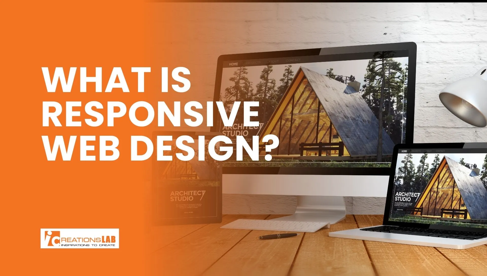
What is Responsive Web Design?
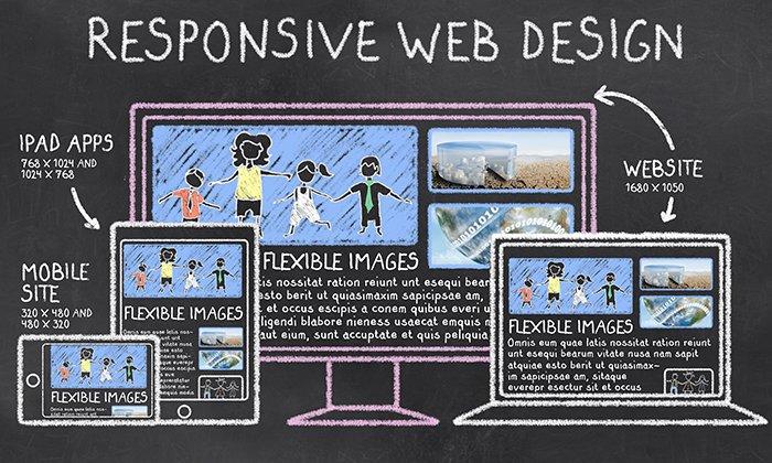
Responsive Web Design (RWD) refers to a development approach that enables websites to adapt their layout, images, and functionalities to fit various device screen sizes and orientations. Unlike traditional fixed layouts that are designed solely for desktop screens, responsive websites use flexible grids, images, and CSS media queries to deliver an optimal viewing experience regardless of the device used.
The essence of RWD lies in its ability to create flexible, dynamic sites that respond immediately to changing viewing conditions. This is achieved through a combination of fluid grids, responsive images, and media queries, which work together to modify the site’s layout and content presentation.
Responsive design is critical for modern websites because of the proliferation of diverse devices accessing the internet. It ensures consistency, accessibility, and user satisfaction, which are all vital for engagement and conversion.
Why RWD matters in modern websites
In today’s digital landscape, users expect consistency and ease of access across all devices. If a website is not mobile-friendly, visitors are likely to abandon it, leading to increased bounce rates and lost revenue. Search engines like Google have also prioritized mobile-friendly sites by integrating mobile-first indexing, meaning that the mobile version of your website is now the primary basis for ranking.
Furthermore, Responsive Web Design significantly reduces development and maintenance efforts. Instead of building separate websites for desktop and mobile, RWD allows you to maintain a single codebase that adapts to various screens. This approach results in cost efficiencies, easier updates, and a consistent brand presence across devices. It underscores the necessity for businesses and individuals aiming to stay competitive and relevant in an increasingly mobile-first world.
Brief history of responsive design
Responsive Web Design was first popularized by Ethan Marcotte in 2010 through his influential article, which introduced the concept of fluid grids and media queries. Prior to this, websites were often designed with fixed widths, which contributed to usability issues on smaller screens.
Over the past decade, responsive techniques have evolved from simple CSS adjustments to complex frameworks that facilitate cross-device consistency. The advent of CSS media queries marked a turning point, enabling developers to craft responsive breakpoints and layouts tailored to specific device types.
Today, responsive design has become a standard in web development, driven by the need for accessible, user-centric websites. It’s a fundamental shift away from one-size-fits-all solutions towards tailored, adaptable digital experiences.
See More: Top Web Design Agency Singapore: Expertise & Client Satisfaction
Key Principles of Responsive Web Design
Building an effective Responsive Web Design requires understanding and properly implementing several core principles. These principles ensure that your website remains functional, visually appealing, and performant across all devices.
Fluid Grid System
A key principle of RWD is the use of a fluid grid system, where the layout adapts proportionally rather than based on fixed pixel widths. This approach employs CSS percentages instead of fixed units like pixels to define element widths.
For example, using a grid that specifies a column width as 50% rather than 600px allows the layout to resize dynamically with the viewport. Such flexibility ensures that content remains accessible and well-organized, whether viewed on a smartphone or large desktop monitor. This scalability minimizes the need for constant redesigns and enables websites to respond gracefully to different screen sizes.
A fluid grid system also helps achieve consistency in content presentation. When the layout adapts proportionally, it preserves visual harmony and alignment, making the user experience smooth and intuitive. It’s like designing with elastic bands—elements stretch and shrink in harmony rather than breaking apart or overlapping.
Flexible Images Media
Images and media elements are vital in engaging users but can become problematic if they are not responsive. Fixed-size images can cause overflow issues or leave excessive whitespace, diminishing user experience.
Responsive techniques for images include using CSS max-width properties, which ensure images scale down within their containers. Additionally, modern HTML features like the srcset attribute and element enable the browser to choose the most appropriate image size depending on the device’s screen resolution and viewport size. This optimizes loading times and visual fidelity, especially on mobile devices with limited bandwidth.
By employing these techniques, websites can serve smaller, optimized images for mobile users while delivering high-quality visuals to desktop visitors. This not only enhances user experience but also improves page load speeds—a critical factor in both user retention and SEO.
CSS Media Queries
Media queries are the backbone of responsive design. They allow developers to apply different CSS rules depending on device characteristics such as width, height, orientation, and resolution.
For example, a media query might specify different layouts for screens narrower than 768px, tailoring the content structure for smartphones. This responsiveness can encompass font sizes, margins, visibility of certain elements, or entire layout shifts. It creates adaptive experiences without needing multiple websites.
Choosing between a mobile-first or desktop-first approach influences how media queries are structured. The mobile-first approach in CSS prioritizes mobile layout adjustments and then scales up for larger screens, ensuring optimized performance on mobile devices from the outset.
Responsive Typography
Text remains a core component of user engagement. To ensure readability across diverse devices, responsive typography employs scalable units like em and rem. These units adapt proportionally to the user’s default font size, maintaining clarity on small screens and readability on larger displays.
Responsive typography also considers line heights, spacing, and font weights to improve visual hierarchy and accessibility. A well-packed, scalable text layout encourages longer visits and reduces user frustration, especially for users with visual impairments.
By adopting fluid typography, designers can create websites that communicate effectively across devices—without sacrificing style or function.
See More: Explore Cutting-Edge Trends in Web Design Singapore
Performance Optimization
A responsive website must load quickly and efficiently, especially on mobile devices where bandwidth may be limited. Performance optimization encompasses minimizing file sizes, leveraging browser caching, and employing techniques like lazy loading—delaying the loading of non-critical resources until needed.
Lazy loading images and scripts reduces initial load times and saves bandwidth, directly contributing to a better user experience and higher search rankings. Additionally, optimizing media assets ensures that websites remain fast, even when displaying high-quality images or videos.
Responsiveness isn’t merely about layout; it extends to how efficiently a website delivers content. Striking this balance is crucial for retaining visitors and improving conversions.
Advantages of Responsive Web Design
Implementing Responsive Web Design offers numerous benefits that enhance both user experience and business performance.
Better user experience across devices
Responsive websites deliver a consistent and optimized browsing experience, regardless of the device. Users spend less time adjusting zoom or scrolling unnecessarily, leading to increased satisfaction and engagement. This fluid experience encourages visitors to explore more, stay longer, and convert more readily.
Moreover, responsive sites adapt to different input methods—touch on mobiles and tablets, mouse and keyboard on desktops—enhancing accessibility for all users. This inclusivity builds trust and fosters positive brand perception.
Improved SEO rankings (Google mobile-first indexing)
Google’s shift to mobile-first indexing prioritizes the mobile version of websites when determining search rankings. A responsive design ensures your site is eligible for higher rankings, increasing visibility in search results. It also reduces duplicate content issues and provides a unified experience, which search engines value highly.
Furthermore, fast-loading, mobile-optimized websites benefit from higher click-through rates, contributing to improved organic traffic over time. Investing in Responsive Web Design is thus not only a user-centric strategy but also an essential SEO tactic.
Cost-effectiveness compared to separate mobile sites
Maintaining separate websites for desktop and mobile is costly and complex. Responsive design simplifies this by consolidating content and codebase into one adaptable site. It reduces development, testing, and maintenance efforts, thereby lowering long-term expenses.
Additionally, a single responsive website ensures consistent branding and messaging, lessening the risk of discrepancies and outdated information. This unified approach streamlines updates and enhances overall web management efficiency.
Higher conversion rates lower bounce rate
A seamless experience across devices directly impacts conversion metrics. Responsive websites reduce usability friction, making it easier for users to find information, fill out forms, or complete purchases. The elimination of layout issues or slow load times keeps users engaged and more likely to convert.
Lower bounce rates on mobile and desktop mean visitors stay longer and interact more with your content, translating into better sales, leads, or engagement metrics. This effectiveness underscores responsive design as a strategic asset for growth.
See More: Innovative website design company in Singapore
Common Challenges and Mistakes in RWD
While Responsive Web Design offers many benefits, it’s not without pitfalls. Recognizing common challenges helps create more robust and efficient responsive sites.
Overusing breakpoints
Many developers tend to add multiple breakpoints to fine-tune layouts, but excessive breakpoints can lead to complex, hard-to-maintain CSS. It can also result in inconsistency and bloated code, which adversely affects performance.
Effective responsive design involves strategic breakpoint selection based on content and device usage patterns. Designers should prioritize key points where layout shifts are necessary and avoid overloading the codebase with unnecessary breakpoints.
Ignoring content hierarchy
Responsive design isn’t just about visual adjustments; it must preserve content hierarchy and importance. Overlooking this can lead to misaligned priorities, where less important content gets more prominence or critical information is hidden.
Content should be prioritized through visual cues and logical grouping, ensuring users can easily find what they’re looking for on any device. This aspect requires thoughtful planning during the design process.
Large media slowing down mobile sites
Heavy images and media files significantly slow down page load times, negatively impacting user experience and SEO. On mobile devices, this slowdown becomes more apparent and frustrating.
Optimizing media using techniques like responsive images and lazy loading ensures faster load times without compromising visual quality. Streamlining media assets is essential for maintaining a truly responsive, performant website.
Lack of browser testing
Failing to test across actual devices and browsers results in unexpected issues for end-users. Variability in device capabilities, screen resolutions, and browser behaviors necessitate thorough testing.
Tools like Chrome DevTools emulators and BrowserStack enable developers to simulate multiple environments, pinpointing issues before deployment. Rigorous testing ensures consistent behavior and enhances overall quality.
Best Examples of Responsive Web Design
Studying exemplary implementations of Responsive Web Design provides insight into effective design practices and inspires innovation.
Netflix – seamless across TV, desktop, and mobile
Netflix offers an impeccable example of responsive design that provides a fluid experience from giant TV screens to smartphones. Its layout intelligently adapts, showcasing content with touch-friendly controls on mobile and expansive visuals on larger screens.
The platform’s use of media queries and flexible visuals ensures consistent navigation and accessibility, reinforcing brand identity across all devices.
Amazon – scalable eCommerce experience
Amazon’s website exemplifies scalability, displaying thousands of products effortlessly across screen sizes. Its grid system adapts to different devices, maintaining functionality like search filters, product images, and checkout flows.
This adaptability is vital for eCommerce success, where ease of use directly impacts conversion rates. Amazon’s responsive design enhances trust and usability, fostering customer loyalty.
Dropbox – clean, minimalist responsive layout
Dropbox features a minimalist aesthetic with clear imagery and straightforward navigation, optimized for all devices. Its layout simplifies complex functionalities, making cloud storage accessible on any screen.
Responsive typography and media ensure that users can focus on content without distraction, demonstrating the power of simplicity in responsive design.
Smashing Magazine – strong use of media queries
Smashing Magazine’s site showcases how strategic use of media queries can create a dynamic layout that evolves with the device. It balances images, text, and interactive elements, ensuring readability and engagement.
This site highlights the importance of thoughtful responsiveness, where design adapts without losing clarity or consistency.
Your Local/Industry Example (e.g., Hospitality Website)
Consider a local hotel or restaurant website. When designed responsively, such sites allow potential guests to browse menus, check availability, and make reservations seamlessly from any device. Proper responsiveness helps capture mobile users, which constitute a significant portion of visitors today.
How to Implement Responsive Web Design
Implementing a successful Responsive Web Design strategy involves choosing the right tools, frameworks, and testing methods.
Choosing frameworks (Bootstrap, Tailwind CSS, Foundation)
Frameworks such as Bootstrap and Tailwind CSS provide pre-built classes and components that facilitate responsive design quickly and efficiently. They include grid systems, media query presets, and UI elements tailored for responsiveness.
Selecting the appropriate framework depends on your project requirements: Bootstrap offers comprehensive components, while Tailwind provides granular utility classes for custom designs. Foundation is another robust option, emphasizing mobile-first development.
Using responsive design tools (Figma, Chrome DevTools)
Design tools like Figma enable prototyping of responsive layouts before development. They facilitate visualizing how your design responds to different screen sizes, enabling iterative improvements.
Chrome DevTools’ device mode allows developers to test website responsiveness in real-time across various devices and resolutions. These tools help identify layout issues early, ensuring a smoother implementation process.
Testing on multiple devices (emulators, BrowserStack)
Testing is critical to catch discrepancies across different environments. Emulators and simulators provide quick ways to preview responsiveness, but real device testing offers the most accurate results.
Platforms like BrowserStack allow you to test your site on hundreds of real devices, ensuring compatibility and performance. Rigorous testing minimizes user friction and guarantees a consistent experience.
See More: Website UI Design Explained: 4 Golden Rules for a Stunning & User-Friendly Interface
Responsive Web Design vs Adaptive Web Design
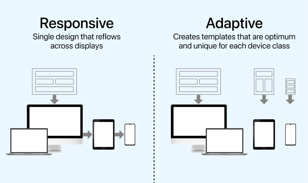
Definition key differences
While both approaches aim to optimize user experiences across devices, Responsive Web Design adapts based on flexible layouts and media queries, whereas Adaptive Web Design uses distinct layouts tailored to specific device categories.
Responsive design is fluid, adjusting continuously, while adaptive design employs predefined layouts triggered by detection of device type or resolution. Understanding these differences helps determine the best approach for your project.
When to use RWD vs AWD
Responsive design suits most modern websites due to its flexibility and cost-effectiveness, especially when content and functionality are consistent across devices. It’s ideal for brands seeking scalable solutions with minimal maintenance.
Adaptive design is suitable for complex sites with highly specialized layouts or functionalities tailored to specific devices, such as enterprise dashboards or media-rich portals. Sometimes, a hybrid approach may be optimal.
Future of Responsive Web Design
Progressive Web Apps (PWA)
PWAs combine the best of web and mobile apps, offering offline capabilities, push notifications, and enhanced performance—all within a responsive framework. As browsing becomes a more app-like experience, PWA technology will drive future responsiveness.
Mobile-first and beyond

The mobile-first approach will remain dominant, encouraging designers to craft experiences prioritized for mobile before scaling for larger screens. Future innovations will incorporate features like voice command responsiveness and gesture controls.
AI and automated layout adjustment
Artificial Intelligence will enable websites to learn user preferences and adjust layouts dynamically without manual intervention. Automated layout adjustments could offer hyper-personalized experiences, making responsive design even more adaptable.
Conclusion
Responsive Web Design is no longer an option but an imperative for modern websites seeking to deliver superior user experiences, enhanced SEO, and operational efficiencies. Its core principles—fluid grids, flexible images, media queries, scalable typography, and performance optimization—work synergistically to create adaptable, engaging, and fast websites. As mobile usage continues to dominate, responsiveness will be fundamental to digital success, requiring thoughtful implementation, continuous testing, and innovative future-forward strategies. Whether redesigning an existing site or building anew, prioritizing responsiveness ensures your web presence remains competitive, accessible, and user-centric for years to come.
Ready to transform your website into a fully responsive marvel? Reach out to iCreationsLAB, a Singapore-based web design and development company experienced in crafting mobile-friendly, high-performance sites that meet your business needs.