Is your website losing customers because it looks broken on mobile? According to Google data, over 63% of searches in Singapore and Southeast Asia originate from mobile devices — and 53% of users abandon a page that takes longer than 3 seconds to load. This is exactly the problem that Responsive Web Design solves.
At iCreationsLAB, after years of building websites for businesses across Singapore — from F&B and hospitality to eCommerce — we have seen firsthand that responsive design is not just a technical trend. It is the foundation every website needs to grow sustainably.
This guide explains RWD from a practical standpoint, with real code examples, an implementation checklist, and insights drawn from our own client projects — not generic theory you can find anywhere else.
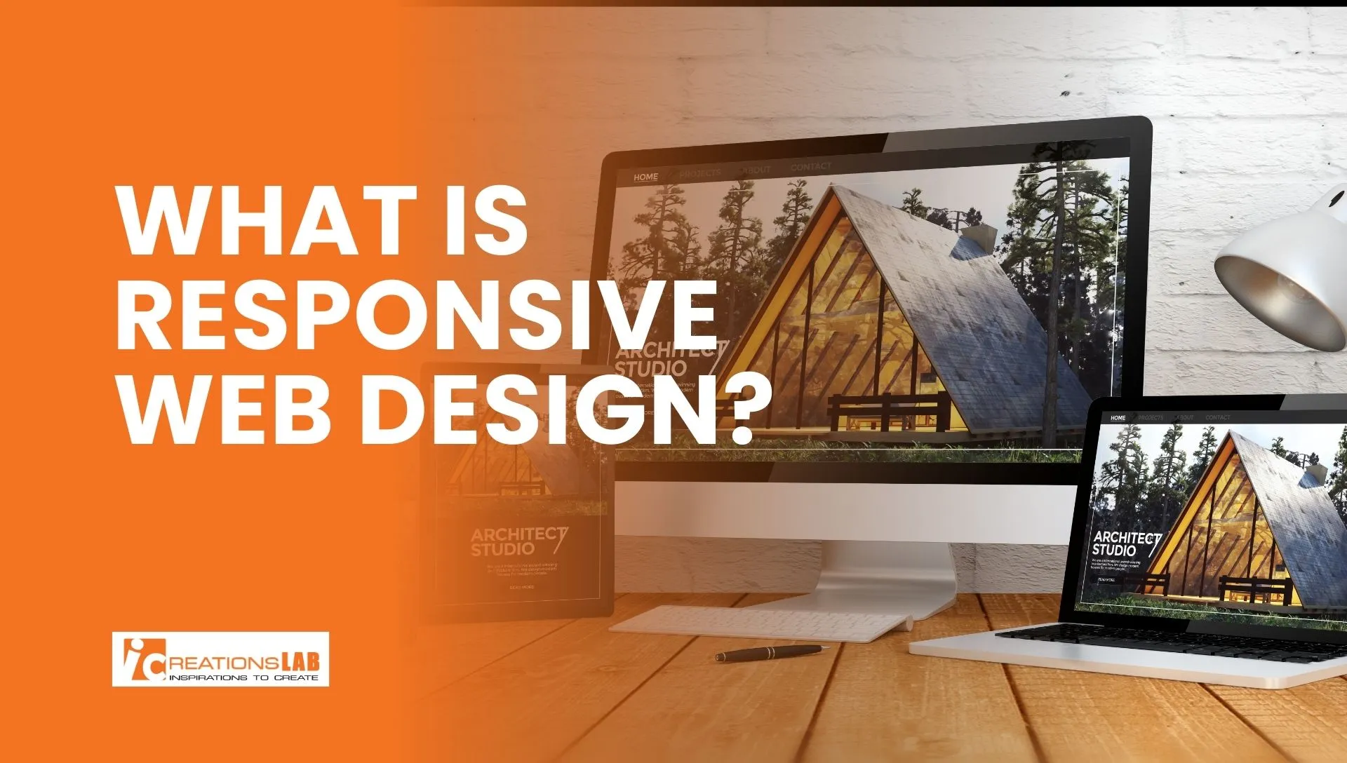
1. What Is Responsive Web Design?
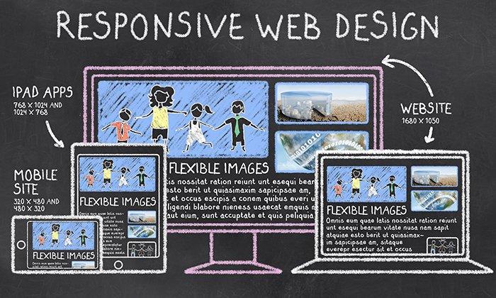
Responsive Web Design (RWD) is a development approach that enables a website to automatically adjust its layout, images, and typography to fit any screen size — from a 375px smartphone to a 2560px desktop monitor.
Think of it like water: a responsive website pours itself into any container (device) while maintaining the same quality of content and experience.
It was first formalised by Ethan Marcotte in 2010, who combined three existing techniques — fluid grids, flexible images, and CSS media queries — into a unified design philosophy. Today it is the standard for all professional web development.
Responsive vs. Adaptive vs. Mobile App: Key Differences
Responsive Design: One codebase, one URL, layout scales fluidly across all viewports. Best fit for 90% of business websites.
Adaptive Design: Multiple fixed layouts served by device detection. More control per device but higher maintenance cost.
Native Mobile App: Installed application with device-native performance. Highest cost, best for complex app-like experiences.
For most small and medium businesses in Singapore, Responsive Web Design delivers the best balance of cost, performance, and user experience.
See More: Top 5 Web Design Companies in Singapore
2. Why Does RWD Matter for Your Business?
Google Mobile-First Indexing
Since 2021, Google has fully switched to mobile-first indexing — meaning Google crawls and ranks your website based on its mobile version first. If your mobile site is slow, missing content, or poorly structured, your entire domain’s ranking suffers — even on desktop searches.
Real Numbers from the Singapore Market
- 63%+ of local searches in Singapore come from mobile devices (Google, 2024)
- Bounce rate increases by 32% when a mobile page takes more than 3 seconds to load (Deloitte Digital)
- Responsive websites see up to 11% higher conversion rates compared to desktop-only optimised sites
- Maintaining one responsive site costs approximately 40% less than maintaining separate desktop and mobile sites
Case study from iCreationsLAB: When we rebuilt a Singapore F&B client’s website from a fixed-width layout to a fully responsive design, online reservations increased 47% within the first three months — driven almost entirely by users completing bookings on mobile.
See More: WordPress Security Singapore: 12 Steps to Protect Your Business Website
3. The Five Core Principles of Responsive Web Design
Principle 1: Fluid Grid System
Instead of fixed pixel widths, fluid grids use percentage-based units so columns automatically resize with the viewport. On desktop, three product columns display side by side. On tablet, two columns. On mobile, a single stacked column. All with the same CSS:
.grid { display: grid; grid-template-columns: repeat(auto-fit, minmax(280px, 1fr)); gap: 1.5rem; }
This eliminates the need to hard-code layouts for every device, keeping your codebase lean and maintainable.
Principle 2: CSS Media Queries
Media queries apply different CSS rules depending on screen characteristics such as width, height, and orientation. The modern best practice is Mobile-First: write CSS for small screens first, then progressively enhance for larger viewports.
/* Mobile base */ .nav { display: none; } /* Tablet and above */ @media (min-width: 768px) { .nav { display: flex; } }
Standard breakpoints in 2026: 375px (small mobile), 768px (tablet), 1024px (laptop), 1440px (wide desktop).
Principle 3: Flexible Images and Media
Images must scale within their containers without overflowing or leaving excessive whitespace. The simplest fix:
img { max-width: 100%; height: auto; display: block; }
For performance, use the srcset attribute and the <picture> element to serve correctly sized images per device, dramatically reducing load time on mobile connections.
Principle 4: Responsive Typography
Small, hard-to-read text is the most common mobile UX failure. Rather than fixed px values, use CSS clamp() to scale font sizes fluidly between a minimum and maximum:
h1 { font-size: clamp(24px, 5vw, 48px); } /* Min 24px · max 48px · scales between */
This approach ensures headings remain impactful on large screens and readable on small ones — without a single media query.
Principle 5: Performance Optimisation
Responsiveness extends beyond layout — speed is a core part of the mobile experience. Users in Singapore expect pages to load in under 2.5 seconds on 4G connections.
- Lazy loading: defer off-screen images until the user scrolls to them
- WebP format: 25–35% smaller file size compared to JPEG and PNG
- Minify CSS and JS: strip whitespace and comments from production builds
- CDN delivery: serve assets from servers closest to your users
See More: Local SEO Singapore: How to Rank Your Business on Google Maps in 2026
4. Business Benefits of Responsive Web Design
Higher SEO Rankings and Organic Traffic
A responsive website uses a single URL for all devices, which consolidates link equity, eliminates duplicate content issues, and improves crawl efficiency. In our experience at iCreationsLAB, sites that migrate to responsive design typically see a 20–40% increase in organic traffic within six months, driven by improved Core Web Vitals and mobile ranking.
Lower Development and Maintenance Costs
One codebase means one set of updates, one round of QA testing, and one deployment pipeline. You never risk desktop and mobile versions falling out of sync. For growing businesses, this operational simplicity compounds into significant savings over time.
Improved Conversion Rates
When the mobile experience is frictionless — no pinching to zoom, no horizontal scrolling, no tiny tap targets — users are far more likely to complete the actions that matter: filling in a contact form, adding a product to cart, or making a reservation. This is why eCommerce is consistently the industry with the highest ROI from responsive redesigns.
Longer Dwell Time
Dwell time — how long a visitor stays on your page — is an indirect ranking signal Google uses to evaluate content quality. A well-structured, easy-to-read mobile experience keeps users engaged longer, feeding a positive cycle of better rankings and more traffic.
See More: Best Web Design Agency In Singapore – Top Picks & Guide
5. Common Responsive Web Design Mistakes to Avoid
Mistake 1: Too Many Arbitrary Breakpoints
Adding breakpoints for every specific device model results in bloated, fragile CSS that is difficult to maintain. The correct approach: add a breakpoint only when your content actually breaks — not based on a list of popular devices.
Mistake 2: Missing Viewport Meta Tag
Without this tag, mobile browsers render the page at desktop width then scale it down, making text tiny and layouts unusable:
<meta name=”viewport” content=”width=device-width, initial-scale=1.0″>
This single line of HTML is mandatory on every page.
Mistake 3: Serving Oversized Images on Mobile
Sending a 2000px wide image to a 375px screen wastes bandwidth and slows load time significantly. Use srcset to serve appropriately sized images per viewport, and compress everything with modern formats like WebP.
Mistake 4: Touch Targets That Are Too Small
Google recommends a minimum tap target size of 48x48px for mobile. Buttons smaller than this cause mis-taps, user frustration, and higher bounce rates. This is particularly important for CTAs, navigation menus, and form elements.
Mistake 5: Testing Only in Browser Emulators
Chrome DevTools device mode is a useful starting point, but it does not replicate real device rendering, scroll behaviour, or touch response. Always test on actual physical devices or use a service like BrowserStack to cover real device and browser combinations.
See More: How Custom Web Development Services Can Skyrocket Your Sales
6. Tools and Frameworks for Building Responsive Websites
CSS Frameworks
Tailwind CSS: Utility-first framework with intuitive responsive prefixes (sm:, md:, lg:). Minimal bundle size after purging unused classes. This is iCreationsLAB’s preferred choice for custom projects.
Bootstrap 5: Comprehensive component library with a proven 12-column grid. Excellent for projects where development speed is the priority.
Vanilla CSS Grid and Flexbox: Zero dependencies, best raw performance. Ideal for teams with strong CSS expertise who want full control.
Testing and Debugging Tools
- Chrome DevTools Device Mode — quick breakpoint testing in the browser
- BrowserStack — test on 3,000+ real devices and browsers
- Google Mobile-Friendly Test — see exactly how Google evaluates your mobile site
- PageSpeed Insights — measure Core Web Vitals (LCP, CLS, INP) used directly in Google’s ranking algorithm
- Figma — prototype and validate responsive layouts before writing a single line of code
7. Responsive Web Design vs. Adaptive Web Design
Both approaches aim to deliver good experiences across devices, but they work differently:
Responsive: One flexible layout that scales continuously. One URL, one codebase, lower cost. Suits the vast majority of websites.
Adaptive: Multiple fixed templates triggered by device detection. More granular control per device, but higher build and maintenance cost.
When should you choose Adaptive? When the mobile and desktop experiences need to be fundamentally different in functionality — for example, enterprise dashboards or media-heavy portals where device-specific optimisation justifies the extra cost. For most business websites, Responsive is the right choice.
See More: What Is a Website? A Beginner’s Guide
8. The Future of Responsive Web Design
CSS Container Queries
Container Queries — now supported across all major browsers since 2023 — allow components to respond to the size of their own container rather than the viewport. This is a significant leap forward for component-driven design, enabling truly modular, reusable UI elements that adapt regardless of where they are placed on the page.
Progressive Web Apps (PWA)
PWAs combine the reach of the web with the experience of a native app: offline capability, push notifications, home screen installation, and near-native performance — all built on a responsive web foundation. For businesses weighing a native app investment, a well-built PWA is often a more cost-effective path to a superior mobile experience.
AI-Assisted Layout and Personalisation
Emerging AI tools can generate responsive layouts from wireframes, suggest optimal breakpoints, and flag responsive issues automatically. More significantly, AI will enable websites to personalise layout and content based on individual user behaviour in real time — making responsiveness increasingly about adapting to the person, not just the device.
9. Frequently Asked Questions
My website already works on mobile. Do I need to make it responsive?
It depends on how it currently works. If the mobile version is achieved by zooming or scaling a desktop layout — resulting in tiny text and horizontal scrolling — that is not true responsive design and it will negatively affect your Core Web Vitals scores. Run a Google Mobile-Friendly Test to find out exactly where you stand.
How long does it take and what does responsive web design cost?
For a new build, responsive design is integrated from the start at no additional cost. For retrofitting an existing site, the timeline is typically 2–8 weeks depending on complexity. Contact iCreationsLAB for a free assessment of your current site.
Which framework is best for responsive web design in 2026?
There is no universal answer. Tailwind CSS is the modern choice for custom, performance-focused projects. Bootstrap is ideal when speed of development matters most. Pure CSS Grid and Flexbox are the best option for teams with strong CSS foundations who want zero dependencies.
Does Google penalise websites that are not mobile-friendly?
Google does not issue a direct penalty, but non-responsive sites rank lower in mobile search results — which now account for over 60% of all searches. The impact on organic traffic is significant and compounds over time as mobile usage continues to grow.
What are Core Web Vitals and why do they matter for responsive design?
Core Web Vitals are three metrics Google uses as ranking signals: Largest Contentful Paint (LCP, loading speed), Cumulative Layout Shift (CLS, visual stability), and Interaction to Next Paint (INP, responsiveness to input). A well-implemented responsive design directly improves all three — particularly CLS, which is commonly caused by images and elements that reflow on mobile.
See More: Website Design Singapore: How to Build a Stunning Website That Converts
Ready to Build a Website That Works Everywhere?
Responsive Web Design is not an optional feature — it is the foundation for being found on Google, trusted by users, and converting visitors into customers. Whether you are launching a new website or upgrading an existing one, getting responsiveness right from the start is the highest-leverage investment you can make in your digital presence.
iCreationsLAB is a Singapore-based web design and development agency specialising in responsive, SEO-optimised websites that drive measurable growth. We have helped businesses across F&B, hospitality, professional services, and eCommerce achieve significant improvements in traffic, engagement, and conversion rates.
Get in touch today for a free consultation and a no-obligation audit of your current website:
- Website: www.icreationslab.com
- Email: [email protected]